Blog > 5 Easy Ways To Update Your Website
Your website sits in the background working hard for you 24/7, but often we neglect to update it because we're busy. It doesn't have to be this way as sometimes the small simple changes can be the most effective.
Devoting a little time now and then to giving it a refresh will ensure it keeps current. It could help your search ranking too as search engines will know you have an actively used website!
Here are five quick ways to update the way your website looks without spending hours on it:
1. Check For Out Of Date Content
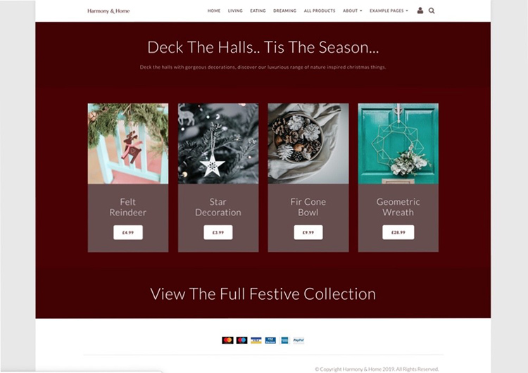
Maybe you’ve got some sneaky seasonal bits still on the website? Or last year's events?
Removing what’s no longer relevant will improve your visitor's experience so spend a little time checking through the pages of your site and updating content to what’s happening now and in the future.
If you have the copyright notice on the footer of your website, publishing your site will update the date to 2019 automatically for you. It’s a little thing, but it instantly shows visitors your site is timely and current.
Read our guide on “How To Publish Your Website” for the steps on how to do this.
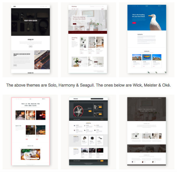
For more design inspiration visit the demonstration site featured in these tips, and if you have a bit more time why not try updating your website look with a brand new template? A few of the latest designs are below and you can view all the themes (with bigger screenshots) here.
2. Add A Hero Photo
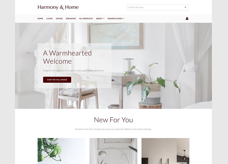
On Content Pages, the hero space is the big image you normally see stretching across the full screen width below the menu. In this example, it’s the photo of the desk above.
The block in the example is a “Hero Card” and uses a background image with overlaid text and a button. By changing this image for something new, you can convey a different feeling or message to your customers.
If your business is seasonal or you have a new service or product this is a simple and effective way to quickly reflect this.
If you’ve not used the content making tools yet, our guide “Getting Started with Content Pages” is a useful read.
If you need photography to update your website, visit our blog of free stock image resources. All the photos on the demonstration site I've used for the examples are from these resources.
3. Set Image Aspect Ratios
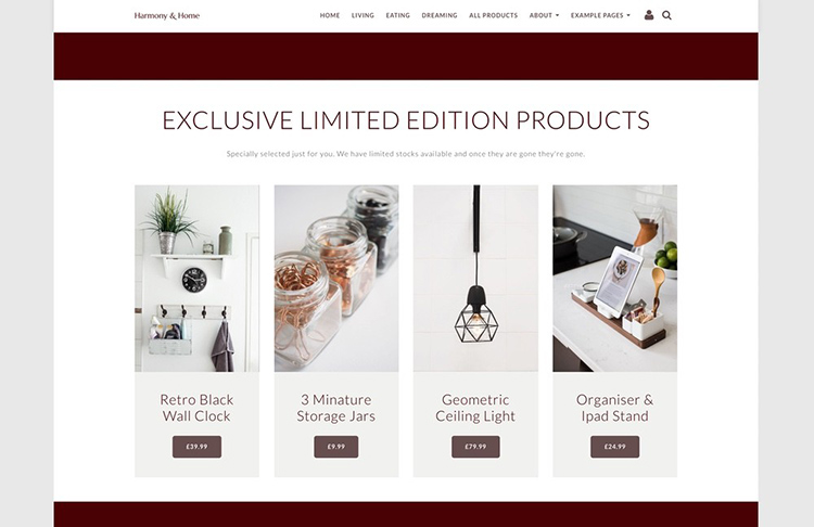
Did you know that our brains love symmetry? When content is laid out clearly the brain will find it more appealing and easier to understand. As a result, your website will also look more professional.
That’s why setting all your images to the same dimensions using the aspect ratio option makes them look so good! In the above example of “Featured Items” (Found within Collections in the Block Selector), all the images are set to 2:3 aspect ratio and all the elements are aligned to the centre.
Choose the aspect ratio that works for the majority of the images you are using - whether they are portrait, landscape or square, and ensure your visitor has a seamless experience that fits together by echoing the design choices from one page to another.
Read our guides "How To Change The Aspect Ratio" and “An Introduction To Image Settings” for more info.
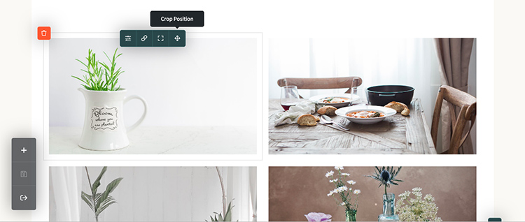
As an extra tip, use the "Crop Position" setting (shown below) to choose the section of the image you want to display. This is useful if you are fitting a square photo in a portrait or landscape space.
4. Create A Gallery
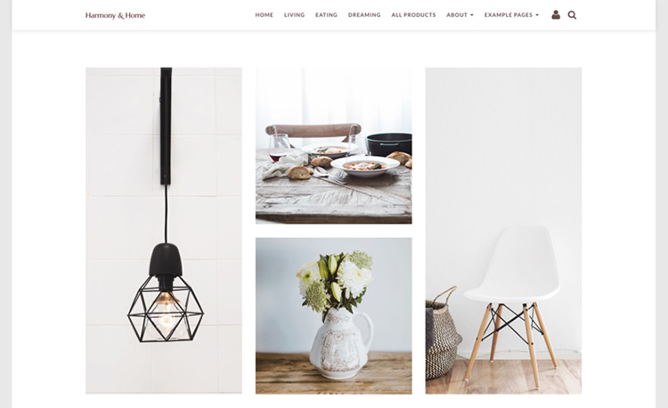
Images can make or break a website’s good looks, not just whether they’re professional photos with great lighting but also how you align them on the page, how uniform they are (as discussed in point 3 above) and how they are balanced with surrounding white space.
When you think about website galleries, you probably picture big grids of images which you click on to pop up a large version. You can easily create a gallery just like this with the “Image Gallery” content block but think also about displaying groups of images in larger more stylised ways (like the example above) - there’s no reason to set up a new gallery exactly as they've been made in the past.
For inspiration, view the gallery examples on our demo site. This will show you a few of the different ways you can display the products, artwork or services you offer.
5. Make A Slideshow
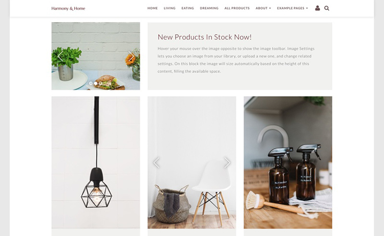
Alongside the gallery inspiration page, we’ve built a page to give you ideas for slideshows too.
Motion captures people’s attention and can be a very effective way to get your visitor to focus on a particular area of the page. In fact, movement works so well that we can’t help but be drawn to it.
Any block that contains an image can be made into a slideshow by selecting more than one image in the “Image Settings”.
You can also choose to have the slideshow autoplay or leave it for the user to explore and discover the other photos.
Used in moderation slideshows are a great way to display more photos in the same space on the page, but be careful that too much movement doesn’t distract from the message you are conveying.
Slideshows work best when showcasing a group of related images that take your visitor on a journey. For example, if you make bespoke wooden kitchens and want to create a page for a case study, a slideshow can engage your visitor, while the rest of the page details what you did and encourages them to contact you.
These tips should only take a minimal amount of time to implement on your website, but the difference that they can make aesthetically is certainly notable.
For more design inspiration, visit the demonstration site featured in the above tips. If you have a bit more time then why not try updating your website look with a brand new template? For the latest website templates available at Create view all the themes (with big screenshots) here.
If you need more advice on your website, drop your Account Manager a message. We’d love to hear about the changes you are making and what you would find useful to read about next.
In Summary
There are 5 things you can do easily to update your website and refresh your content:
- Check For Out Of Date Content
Make sure to also update the information in your footer from last year. - Add A Hero Image
By doing so, you can immediately change the look and feel of your page. - Set Image Aspect Ratios
This will help to keep the images on your site uniform. - Create A Gallery
There are a number of different layouts you can choose from to showcase your pictures. - Make A Slideshow
Movement is a great way to capture your audience's attention and focus them on an area of content
We hope that you found these points useful. Ready to move onto the next step? Your home page is one of the most important pages of your site and most of your visitors will land there at least once while they investigate what you offer. Find out how to update your home page to effectively work towards converting your visitors in our recent post.
What tips do you have when it comes to quickly freshening up your website? We'd love to hear your thoughts in the comments below!


