Blog > How To Make Your Website Home Page More Effective
Posted By Create
Your home page is one of the most important pages of your site and most of your visitors will land there at least once while they investigate what you offer. Are you confident that your home page is doing all it can to turn those visitors into customers?
Even if your website is visually stunning, coupling your design with a precise and practical approach will help your website to be more effective and improve the likeliness that your visitor will complete the objectives you’ve planned.
A great home page will:
-
Drive your visitors closer to taking action towards your primary goal.
-
Signpost to other resources that will also help a visitor to take action.
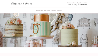
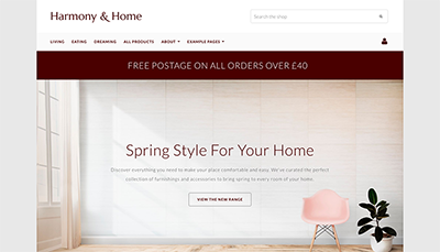
This article will help you to consider what you want to achieve from your website and outline eight ways you can start focusing your customers towards your goal. As part of this post, we have also worked on developing our example sites. This is so that you can see how the following 8 points can be implemented as a whole. See them below:
The Objective
When you first started your website, what did you want to achieve from it? Sales? Awareness? Enquiries? What is your website objective?
Before you can begin to build, it’s crucial to know what the primary action you want your visitor to take actually is. This will help you plan your website and the content you display.
It can be easy to fall into the trap of having too many objectives for your website. Often, as a website develops, side hustles are added and the number of different objectives grows. This can pull potential customers away from your primary goal and the action you really want them to take.
It can be helpful to consider your website as a pathway.
With too many objectives, your path becomes a maze. Potential customers don’t know where to go and get lost easily.
When you keep a singular goal in mind, you can guide your customers on the straight path. They may wander slightly, but you can always pull them back on track with clear direction to your goal throughout your pages.
Want Your Own Website?
Start Building Today!
No credit card needed. By submitting this form you agree to our T&Cs and Privacy Policy.
1. Make Your Message Clear
As soon as anyone lands on your page, your value proposition and the path towards your objective should be made clear.
Visitors can often be unforgiving in their searching behaviour and the first 10 seconds spent on your website is crucial to capturing your customer's attention before they click the back button.
By clearly stating what you can offer your customer, you are immediately clarifying to them whether or not they are in the right place.
Spend some time objectively looking at what your visitors see when they first land on your page. Does what’s there grab their attention and move them towards your goal? The other point to consider is how well you are conveying your message.
As a website owner, no doubt you have a lot to talk about! You are rightly proud of the business and the brand you have built. The temptation is to fill your home page with all sorts of information that perhaps should be separated onto other pages of your website.
Don’t give the game away too early. As mentioned previously, your home page should act as a signpost to the rest of your site. This helps your visitors to scan your page for what they are looking for which, in turn, improves their experience on your website.
Plus, the faster they can find what they are looking for on your site, the faster you will meet your objective!
Do This Now >>
2. Make Your Header Actionable
While your website header and menu may apply to the whole of your site rather than just your home page, it is one of the first things that people will see when they land on your website. It’s therefore important that it helps set the right first impression.
There are multiple header options that you can choose from. Selecting one with the right information and icons can highlight what your website is for and help with the visitors browsing experience
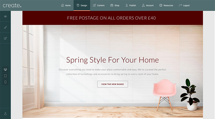
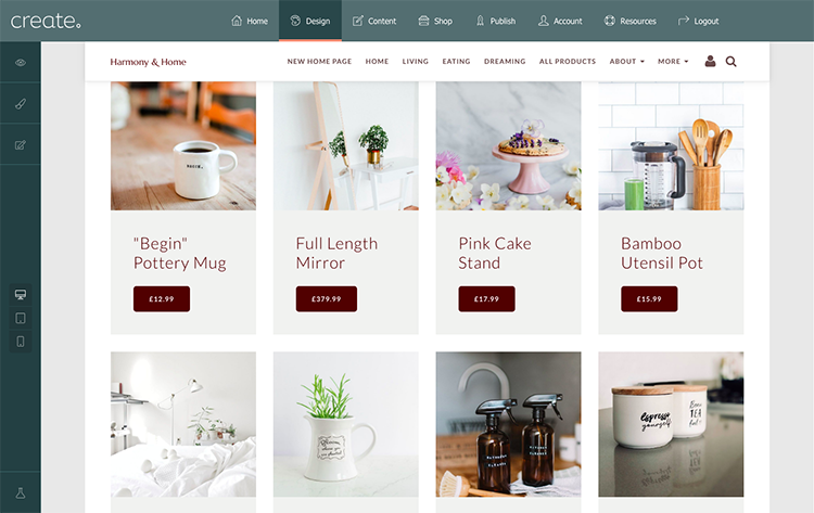
QUICK TIP: If you run an online shop, applying basket and user icons to your header makes it immediately obvious to visitors that they can make a purchase on your site. Not only this but when a user adds items to their basket, these icons make the checkout easily accessible from wherever they are on your website.
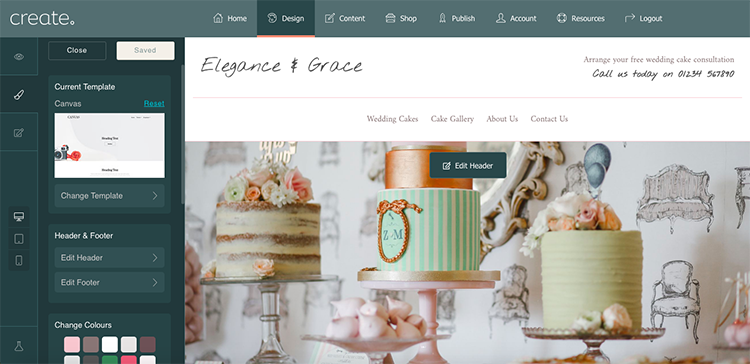
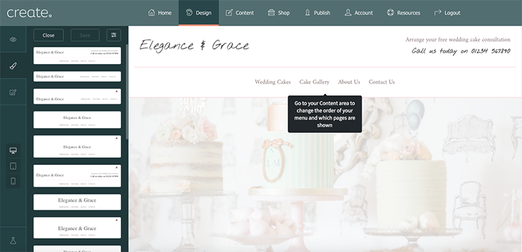
If you run a website that isn’t ecommerce, you could add contact or other information to your header, as per the example above. Think about how this will help you meet your objectives.
If someone visits your site with the prior intention of contacting you, adding your contact number in your header means that they don’t have to sift through your site for this information. It is available to them immediately, no matter what page they land on and can result in you gaining the lead for your business faster.
Here’s how to choose your website header:
- Log in to your Create Account.
-
Click on “Design” on the top menu.
-
In the design panel (on the left-hand side) select “Edit Header”.
-
Scroll through the list of headers and choose one with your desired call-to-action from the list.
-
You can add elements by clicking “Block Settings” in the top right-hand corner of the menu and selecting the “Elements” tab.
3. Make The Objective Easily Accessible
If you were visiting the site above and wanted to find out more about an item, would you click the image, heading or button?
It’s not something that most people think about when browsing a site. Your visitors choice of where to click is likely to vary from session to session and person to person. Often it will be quite an unconscious action.
Therefore, it’s crucial to make sure each image, text, heading etc. is linked, as it can lead to frustration if your visitor clicks on one of the elements to find it doesn’t lead them on to the next page like they think it should.
This same rule can be applied to almost any block on your page. Ask yourself:
-
Would a link on this block encourage users towards my objective?
-
Which elements might a user click on to visit this page?
Here is how to add links to the items on your page:
-
To add links to headings or buttons, click inside of the text area and click on the ‘Link’ Icon. Go to the “Your Pages” tab and select the relevant page from the drop-down boxes.
-
To add links to images, hover over the image and click on the ‘Link’ Icon. Go to the “Your Pages” tab and select the relevant page from the drop-down boxes.
4. Prioritise Your Menu To Lead Visitors
Still focusing on your header, have you considered the order and organisation of your menu items?
Visitors will be reading your page like a book, from left to right. So what’s the next page you want them to visit after your home page? What brings them closer to your goal?
To arrange the order of your menu items:
- Log in to your Create Account.
-
Click on “Content" on the top menu.
-
Drag and drop your pages into the desired order.
The other thing to consider is how busy your menu is. If you have too many menu items, your visitors may become confused as to where to go next because they’re spoilt for choice.
An effective way to work around this is to arrange your menu items into a drop-down menu. What pages can you group together and categorise underneath a heading?
To create a drop-down menu:
- Log in to your Create Account.
-
Click on “Content on the top menu.
-
Drag a sub-menu heading underneath the main menu item and move to the right so it becomes tiered.
5. Boost Trust With SSL Encryption
In July 2018, Google’s deadline for a more secure web was met. Since then, they have been marking any website viewed in their Chrome Browser (The Firefox Browser does this too), without SSL Encryption, as “Not Secure”.
Websites that failed to meet the deadline may have seen higher bounce rates, lower session durations and a drop in their search rankings on Google. This is because visitors are much less likely to trust a website that doesn’t have their security in mind.
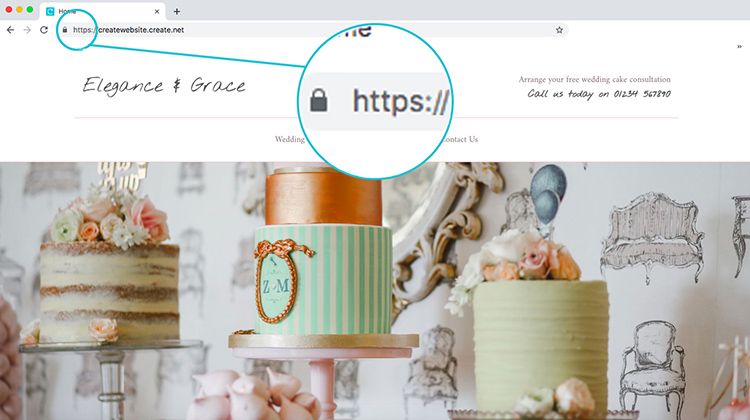
SSL protected websites are easily identified by the locked padlock icon next to their URL and the “https://” prefix.
By protecting your site with SSL Encryption, you are showing your visitors that they can trust your site.
If you're on Create, there's no need to worry. Your website will automatically be set up with SSL enabled; giving both you and your visitors peace of mind.
6. Lead With Your Best Offerings
What is your most popular offering at this moment in time?
If you run a shop, your featured or best-selling products for the month are the most likely to influence people to make a purchase. Why not put them front and centre on your home page?
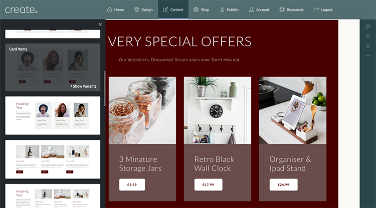
Collection blocks are a great way to do this. They allow you to showcase some of the hottest items or offerings that you have available in your shop.
By placing these prominently on your home page, you are immediately encouraging more click-throughs to your store.
To make a collection:
- Log in to your Create Account and edit your home page from the "Content" tab.
-
Go to the ‘Block Selector’ in the bottom left corner of the screen (the ‘+’ icon) and select ‘Collections’ from the drop-down box.
-
Choose your favourite collection block.
-
Add your text to the headings and buttons. Don’t forget to add the relevant link to both. Click inside the text areas and a ‘link’ icon will appear above them.
-
Hover over the images and select ‘Image Settings’. Select or upload your images.
Don’t forget to add links to your images in the same way you did before.
Of course, collections aren’t the only block you can use. If you have a shop sale running, you could use a promotional banner that you have designed. If you offer a service instead of a physical product you could use a Featured Heading to promote this.
The key is to always lead with your most popular offerings. The product or service that is most likely to appeal to the most people, excite them and lead them a step closer to achieving the objective of your site.
7. Show Off Your Testimonials
Testimonials are fantastic for building credibility and trust with your site visitors.
While you believe 100% in your products and/or services, potential customers can naturally be a little bit sceptical, especially when they might not have heard of you before.
They are much more likely to be receptive to what their peers have to say about your website. Which is why showcasing your testimonials is one of the best ways to reassure new visitors.
By providing unbiased reviews, you are giving your visitors ‘social proof’ that you are a trustworthy vendor.
To add a testimonial block:
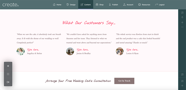
- Log in to your Create Account and edit your home page from the "Content" tab.
-
Go to the “Block Selector” and select “People” from the drop-down box.
-
Choose from any of the Testimonial Blocks to display on your website.
-
Go to “Block Settings” on the right-hand menu and select the “Elements” tab.
-
Switch on the option for “Show Block Heading”.
-
Add your heading and your reviews.
8. Check How Your Home Page Looks Across Devices
How your web page displays across different devices is more important than ever.
Did you know that more people are browsing on their phones now compared to their desktop?
If your home page has not been built with mobile devices in mind, you may be losing a large portion of your potential customers.
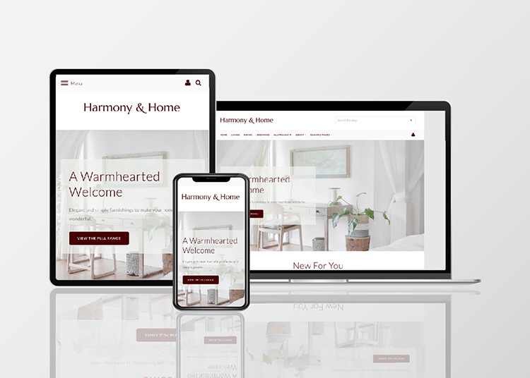
All of the Templates now available on Create are mobile-responsive and Content Builder makes sure all of your content seamlessly adapts to whatever screen your website is being viewed on.
However, when building pages, it's easy to focus solely on the desktop experience of your users. It's important to make sure that everything is displaying how you want it to on your website's mobile experience too.
This is really easy to do. Just head to the Design tab in your Create account. There are three icons in the left-hand menu that allow you to switch between Desktop, Tablet and Mobile previews of your website.
Ian, one of our expert Account Managers, shows how you can use the Design screen and build fully responsive and beautiful pages in the video below.
In Summary
To improve your home page, consider the following 8 points:
-
Make Your Message Clear - Have an immediate, eye-catching, value proposition on your home page to keep visitors on your site for longer. Keep your text concise and let your other pages do the talking.
-
Make Your Header Actionable - Your header is visible across the entirety of your home page. Be sure to add your call-to-action here so visitors can easily take the next step whenever they are ready.
-
Make The Objective Easily Accessible - Have you added links to every relevant item on your home page? Whether they are images, headings, text or buttons, if it looks like they should lead somewhere, be certain to make sure they do!
-
Prioritise Your Menu To Lead Visitors - What’s the next page you want your potential customers to visit? Organise your menu in the order of the journey you would like your visitors to take and keep it clear and tidy by using drop-down menus.
-
Boost Trust With SSL Encryption - Securing your site shows you have considered your visitor's privacy and also helps to establish trust. Enable this on your site to keep visitors around longer and to improve your chances of turning them into a customer.
-
Lead With Your Best Products - Your popular products are the most likely to inspire action. Adding them in a prominent position on your home page can be a great way to entice visitors through to your shop and making a sale.
-
Show Off Your Testimonials - Social proof is an effective method for establishing trust. Be sure to put a sceptical visitor’s mind at ease by proudly displaying what their peers have said about your product or service.
-
Ensure Your Website Is Mobile-Friendly - Using a website template which responds in size to your visitor's device will make sure your website provides the best experience seamlessly.
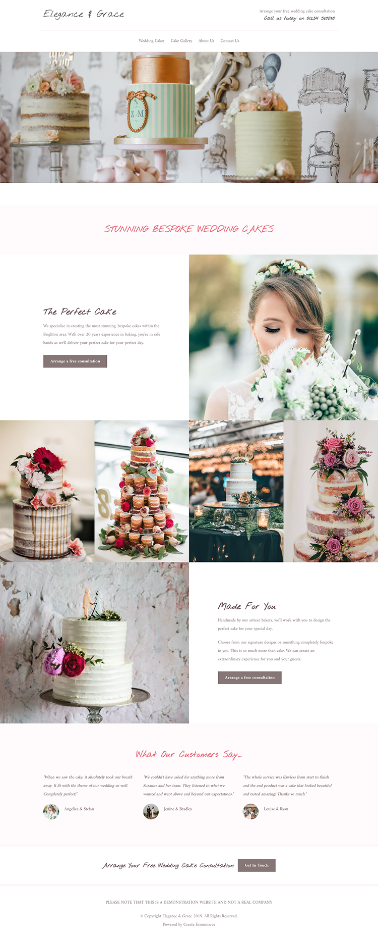
Here are the two finished home pages that we used for this article:
Elegance & Grace
Harmony & Home
To truly test to see if your home page is converting more of your visitors, you should monitor it regularly using Analytics. You can track how your home page is being used, how many pages on your website are viewed and what journey is taken by your visitors.
What have you found works for you on your home page? Is there particular content on your website that converts more visitors on your site? Share your thoughts in the comments below!
If you are a Create Customer and you’re considering rebuilding your home page, you can get non-partial, expert feedback from the members of our Create Community on Facebook. Simply request access with your domain name and an admin will approve you as soon as they can.


