Help Centre
March 2022
Imagine you’re walking down the high street and you're looking through the windows of each of the small businesses. You’ll find their window displays showcasing their products organised in their own unique style. It’s what catches your eye and encourages you to come inside and have a browse. Everything is arranged inside exactly as they intend and how they like in a way that hopefully appeals to you and the rest of their customers too.
Much like how you group products together in the store, display them for the customers to interact with and hopefully purchase, your categories should be arranged and displayed how you would like them to appear. We’ve updated Category Layouts to give you more freedom in how you display your shop.
In this update, we have replaced our previous Grid and Row Layouts with new designs that provide a foundation for more customisation and styles. These allow you to build a new aesthetic for your store that matches your design and the branding of your site and create a new shopping experience for your customers. Here’s what’s new:
The Grid Layout
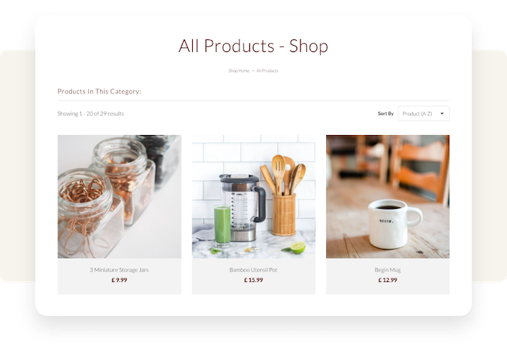
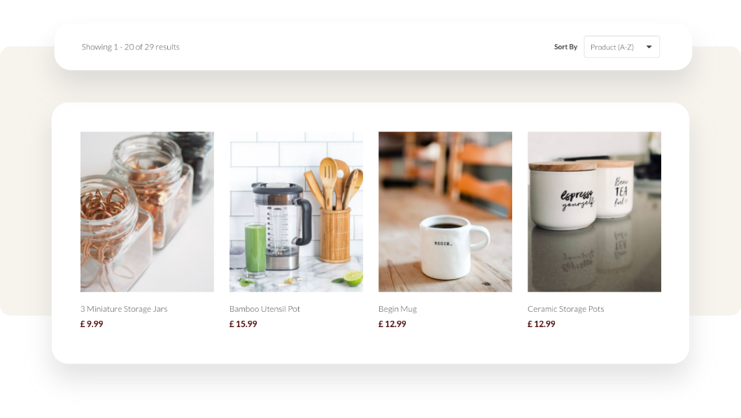 The Grid Layout is fairly typical for e-commerce stores as it beautifully displays a wide range of products on the page at once. It allows for your product photography to take centre stage. Visualisation is powerful and so by leading with imagery, your customers can see more of the details of your product, visualise owning the product and make a decision to click through to find out more and make a purchase.
Some types of shops that might benefit from this layout could be craft and gift shops or suppliers. If you have lots of products, this is a great solution for showcasing more products at once. It can also reduce how many pages of products customers need to click through when looking through a category on your website.
The Row Layout
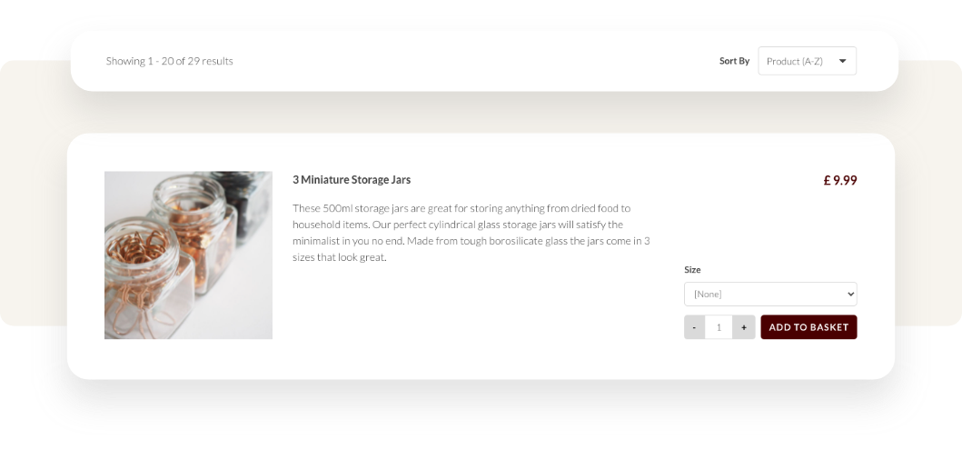
The Row Layout allows you to pace your customer’s shopping experience and provides the opportunity to display more detail about each of your items on your Category pages - from the short description to the customisation options available. With more detail about the listing, you can encourage clickthroughs by specifically highlighting the unique value each item in your shop has to offer.
An example of a shop where a Row Layout could be beneficial is a jewellery shop, where you’d want to highlight key details about the materials used for an item or provenance of an older piece. Or perhaps a home decor shop where you want to point out details about the style or distinct features of each item. A Row Format is ideal though for any shop with fewer products or higher ticket items where you want to briefly highlight what’s special about your items.
There is no strict playbook for the right way to structure your Shop Categories. After all, it is your shop and we want to provide you with the tools to build it however you want! These two formats can provide a foundation for you to build from and experiment with to find a style that works for you.
More Style Options
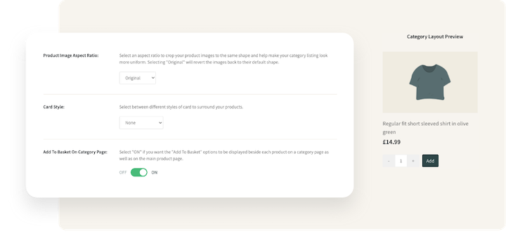
When you’ve decided which format you’d like to use across your Categories, you can fine-tune the details with the range of new style options we have available. You can preview your changes as you make them by using the Category Layout Preview on the right.
The first option is the Product Image Sizer. This is a quick and easy sizer you can use to alter whether the Product Images in your categories are smaller to fit more items per row, or bigger and bolder to showcase the finer details from the Category Page.
In addition to the Product Image Sizer, we’ve also included a tool to set a default Product Image Aspect Ratio. Using this, you can apply a uniform crop size to all the product images in your categories. If you have a mixture of images that are landscape, portrait and /or square then this is a quick and easy way to tidy up your store. It’s best to also choose the image aspect ratio that will suit the majority of the images in your store. If most of your images have been taken to fit a landscape crop, setting this as the default will provide you with the best results for your store.
With the new Category style settings, you can also determine how your product titles and prices are aligned on each item in your Category to your preference, as well as set a Card Style across your items. These are just two more features that allow you more creative freedom to find and utilise a style that works for your brand across your Category pages. Bear in mind that if you have alignment and Card Style preferences set on your Content Pages, these Category Layout tools are a great way to create uniformity and consistency across your entire website by selecting the same styles.
Add to Basket Straight from the Category Page
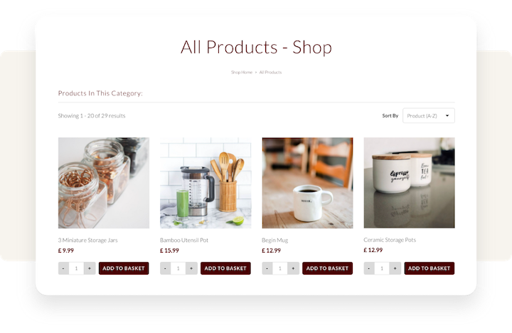
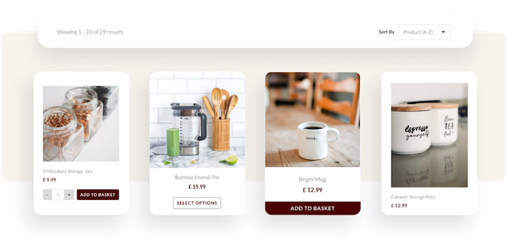
With this release comes the introduction of the Add To Basket On Category Page option. This is a straightforward toggle option that if you switch on will create Add to Basket buttons underneath the product listings on your Category page.
This allows for your customers to quickly browse through your categories and add items as they browse without having to click to read more. The Add to Basket button on Category Pages would likely work well for e-commerce stores with lots of products that don’t require shoppers to read into the finer details you have listed in your product descriptions. It would also work well if you sell multiple types of a product or have regular shoppers who come back for the same products repeatedly as it will speed up their purchasing experience.
The new Add to Basket On Category Page option adds a new dimension of ease to your shopping experience. It may not be the best option for some stores where it’s important to read into the details and understand a product. In other cases, like the examples above, this button could offer more convenience and lead to more items being added to customers’ baskets.
Get Started with Category Layouts
We’re really excited to start bringing you more options that give you more freedom over the presentation of your shop. With the new Category Layout tools, there are hundreds of combinations you can utilise to create a look that’s unique to you.
With the introduction of the Add to Basket on Category Page buttons, we hope that this update will enable you to further customise the aesthetic of your site and also tailor your customers’ journey in a way that leads to more sales and higher basket values.
Related Articles
Related Articles
More Questions?
If you have any further questions, please get in touch and we will be happy to help.
Get in Touch

