Help Centre
Support > Ecommerce > Categories and Products
How do I change my product and category layouts?
Create offers a variety of different options for displaying both your shop categories and product pages.
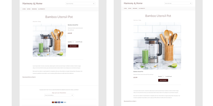
There are two different product layouts available to choose from which will alter how the products appear in your shop. You can choose from a left-aligned layout, which is the default option selected, or the centrally aligned option.
How Do I Change My Product Layout?
You can select your preferred product layout from within your Create account in the Shop Settings area.
Shop > Settings > General Configuration > Products
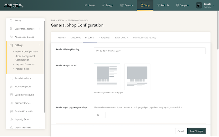
The left-aligned product layout is the default setting. This will display your product image to the left, with the product title, price and short description to the right. The long description is displayed below.
The centrally aligned layout will display a larger product image with the product title, price and descriptions all located below the image.
Below you can see both options being used on the same product. The left image is left-aligned and the right is centrally aligned.
How do I Change My Category Layout?
There are two different category layout options to display your shop content. You can choose from the Grid Layout or the Row Layout. The most suitable layout will be determined by the look of your site and the type of products you are selling. Both come with their own benefits.
You can select your preferred category layout from within your Create account in the Shop Settings area
Shop > Settings > General Configuration > Categories
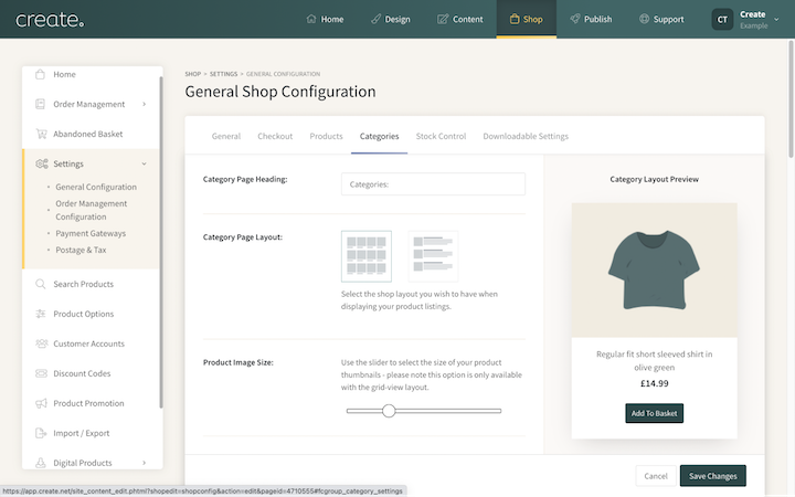
**PLEASE NOTE, if your selected layout is labelled as Discontinued - you are using one of our older category layouts that are no longer supported. We recommend selecting one of the new layouts for the best experience and access to the latest features.**
The Grid Layout
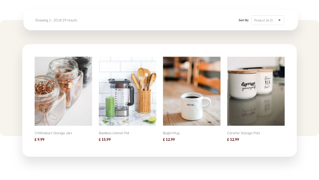
The Grid Layout is the default selection for Create accounts, displaying your products in a grid-like format, allowing for lots of products to be visible on the page at one time.
When using the Grid Layout you have the option to increase or decrease your image size by using the Product Image Size slider. Dragging the slider to the right will increase the image size and to the left will reduce the size.
Additionally, when using this layout, you can set if you would like your products to be displayed in a single column on mobile (the default setting) or for two columns of products to be displayed.
This is controlled by the setting: Products/categories per row on mobile
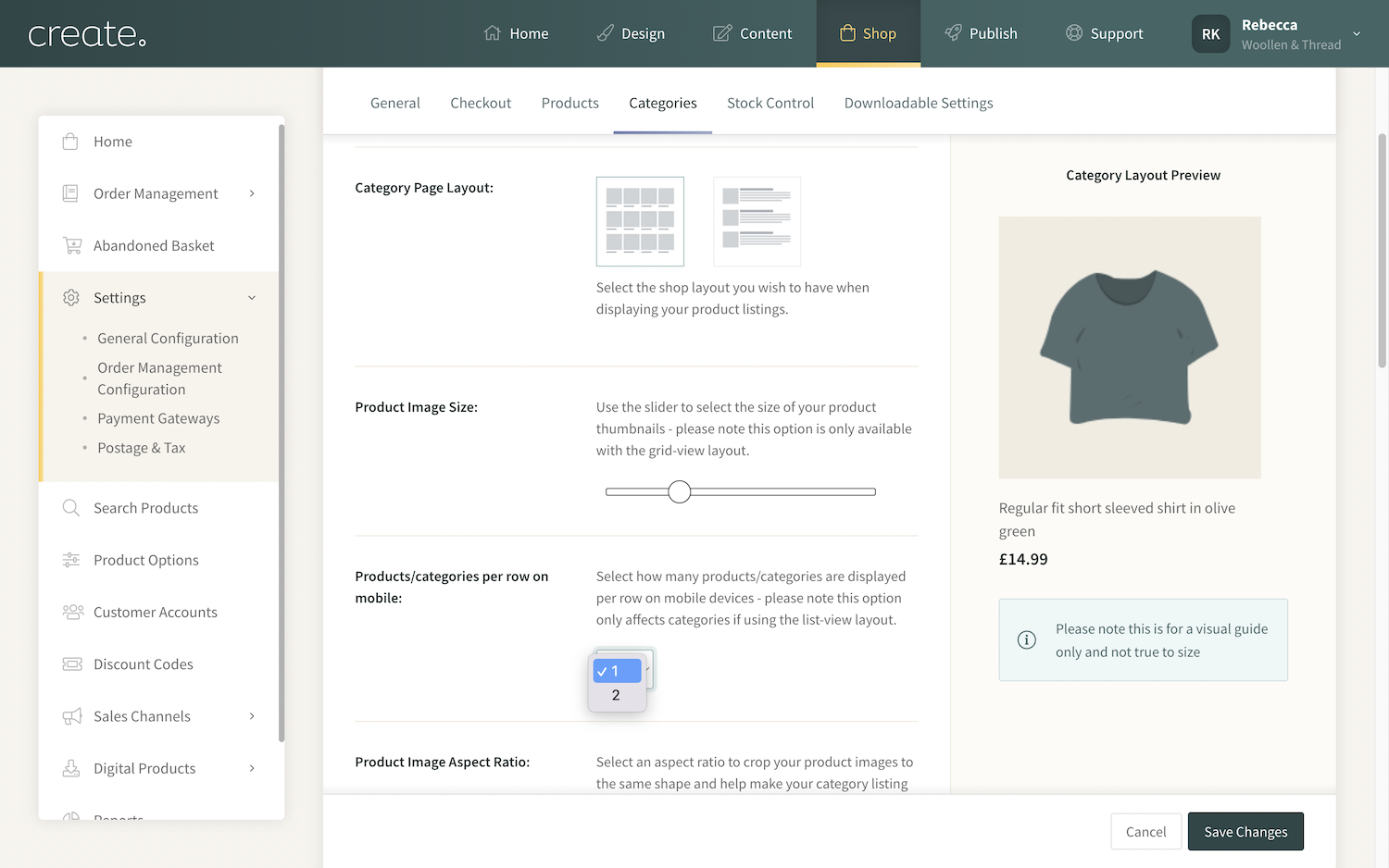
With the setting changed to 2, products will display as 2 columns when viewed on mobile, so visitors can see more of your products on the screen at once.
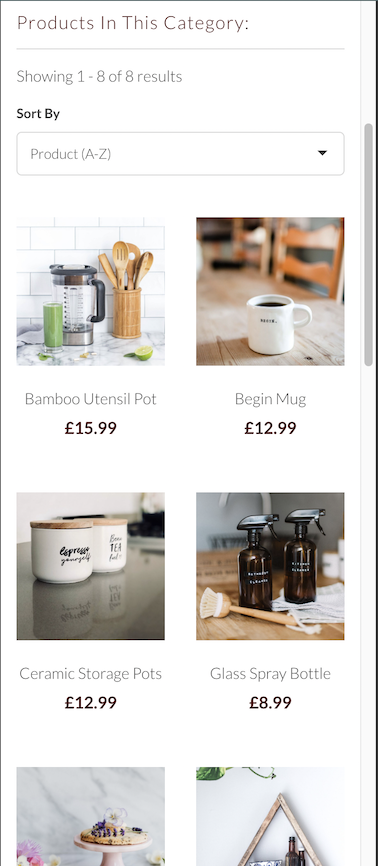
The Row Layout
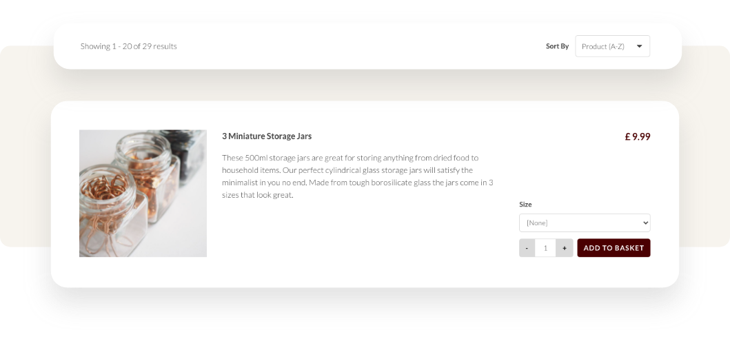
The Row Layout allows you to display more detail about each of your items on your Category pages - from the short description to any customisation options available. This is ideal if you would like to showcase details and specifics to customers, without them having to click through to the product.
Product Style Options
Alongside setting your preferred display layout for your categories, Create also offers you control over how the product image and details will display within the categories.
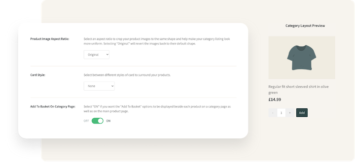
Product Image Aspect Ratio - This allows you to set a uniform aspect ratio for all of your product images. This is ideal if your photos are a mixture of different ratios and you would like a more uniform look to your category pages.
Text Alignment - This will set the orientation of the text which is displayed below the product thumbnails within the categories. You can choose from Left, Center or Right aligned.
Card Style - Choose from a range of different card styles which surrounds the product thumbnail - or choose to have no card style at all.
Add To Basket On Category Page - Enable the option of displaying an Add to Basket button below the product thumbnail, allowing customers to easily add the product to their basket, directly from the category page.
If you enable this feature, you can choose the button to display as either Normal or full width
Button Size - If the ‘Add To Basket’ button is enabled, you can choose from a Normal or a Full Width button.
The example below is using the Full Width option.
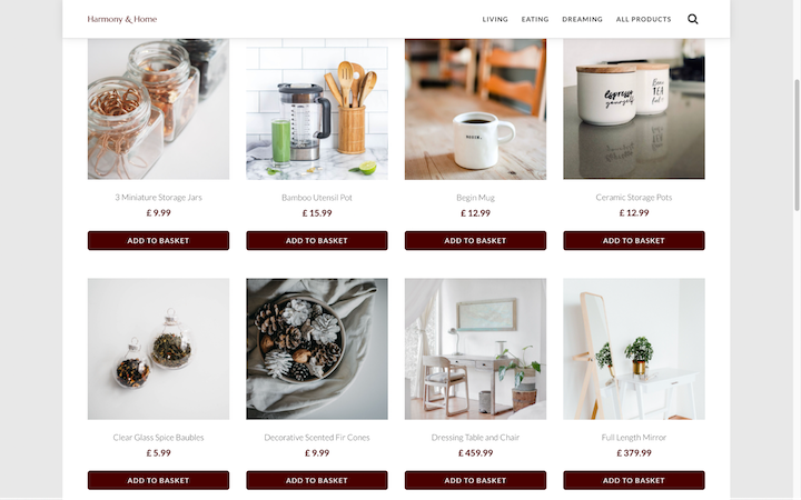
If there are specific product details/information that you wish for the customer to read or review before making the purchase, then we would recommend not enabling this feature.
Related Articles
More Questions?
If you have any further questions, please get in touch and we will be happy to help.
Get in Touch

