Blog > How To Build Your Website Contact Page
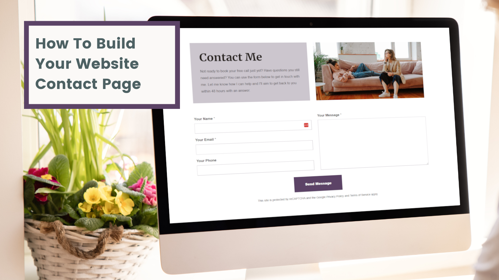
If you’ve read our blogs on designing your website and building your home page, you’ll already be well on your way to building a website that looks amazing and serves your business needs.
You may have noticed a theme throughout that when building websites, it’s crucial to focus on an overarching objective. This helps to tailor your visitor’s journey towards taking meaningful action.
So if your home page is the start of the journey, let’s skip a few steps to the end of the journey (or phase 1 at least) and take a look at building your Contact Page.
Creating a Contact Page is a straightforward and satisfying task. It’s one of those jobs you can quickly tick off your to-do list. Especially with Create where you can use a preset layout and customise it with additional Content Blocks.
Want Your Own Website?
Start Building Today!
No credit card needed. By submitting this form you agree to our T&Cs and Privacy Policy.
However, this page is a significant stepping stone in your website visitor’s journey. It’s important, therefore, to make sure it’s as effective as possible.
In this blog, we will guide you through the process of building a contact page that not only looks amazing but also serves its purpose seamlessly. We’ll provide you with practical tips, inspiration and insights to help you make a page that consistently works for you.
Before we get started, check out Ian's practical step-by-step video on putting together a Contact Page on Create. You'll see exactly how to navigate our tools and customise your page to get a look and feel that works for you:
Consider Why & How Users Would Contact You
Before you start building a Contact Page, you should consider what type of page would be the best fit for your business.
Take, for example, an online store. Every website requires a way for your visitors to contact you, but an online store doesn’t require everyone to get in touch as part of their purchasing journey. With this in mind, a simple page with a contact form and other ways to contact you would suffice.
This isn’t the case for other businesses. If you sell out of a physical location or are promoting an event, you may find a Map Block might come in really useful for helping people to find you.
Another case is if you provide a service. It can pay to give people more options to reach out in a way that’s comfortable to them as this is a vital part of starting the customer journey, as well as building out content to encourage them to reach out.
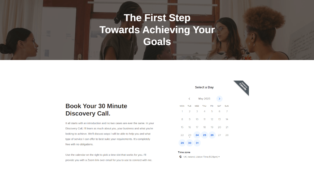
The above example thoroughly considers the main purpose of the Contact Page. The main website objective of Shine is to encourage people to book a free consultation. With this being the case, people aren’t primarily encouraged to get in touch by filling out a form, but by booking the consultation instead (You can add a booking calendar like this with Calendly).
By considering who your customer is, whether it’s necessary for them to contact you and how you make this simple for them is really useful for knowing how to build a page that’s going to serve them best.
Include A Form
One of the golden rules, not just for your contact page but for every page of your website, is to make taking action easy.
When reaching out through a website, most people may prefer a means to reach you via email. This means that they can ask questions and consider their responses before proceeding.
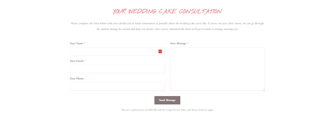
The way to make this action easy is by including a Contact Form on your page. This is really easily achieved using Contact Blocks on Create.
These Blocks simply ask for a name, email address, phone number (but not required) and a message. When they click send, their message will go straight through to your inbox.
This is such a simple and straightforward way to encourage people to contact you. They don’t even have to leave the page to take action.
There are several different ways you can lay out your Contact Form on Create, but as a general rule, if you’re creating a contact page, a form will be a necessity.
Keep It Simple
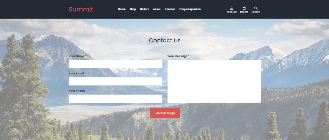
The thing about a Contact Page is that it serves a singular purpose. When someone lands on this page, they’re intentionally looking to accomplish one action - To reach out to you.
Considering this, you really don’t need to go overboard when building this page. In fact, too many actions added to the page can be overwhelming to your visitor.
Keep your primary contact action near the top of the page to make completing the action easy for your visitor to complete.
By keeping the main way to contact you at the top of the page before your visitor even has to scroll, they can easily complete the action they came to the page to do.
Explain What To Expect
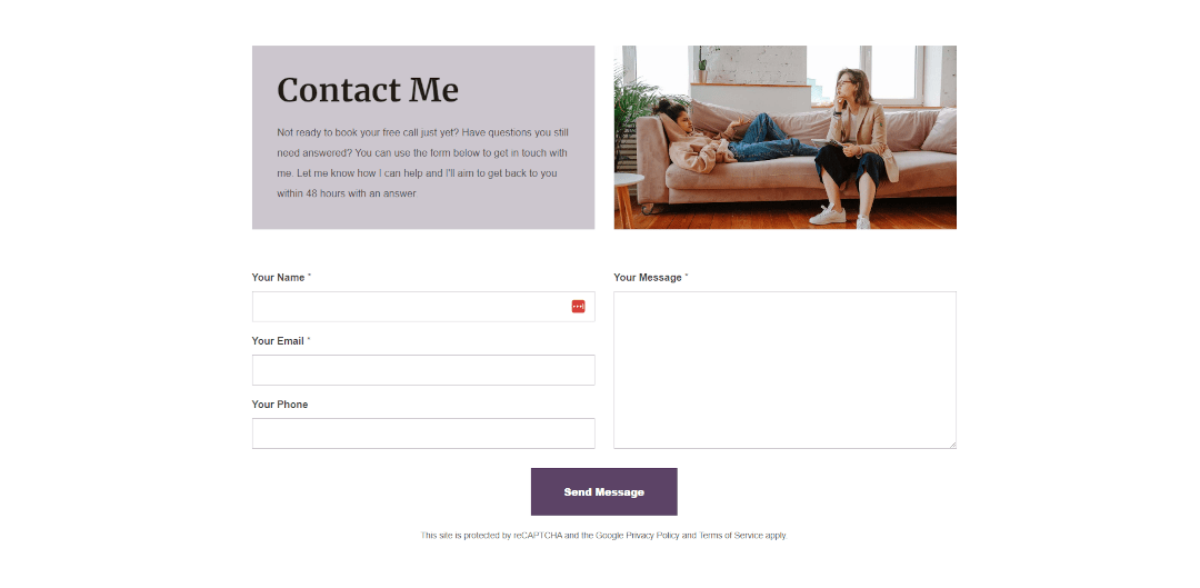
When someone is prepared to use your contact page and reach out to you, it’s a good sign that they’re engaged and beginning to start a relationship with your business.
In building this trust, it’s crucial to set expectations with the person reaching out. By letting them know what to expect, you can help to put their mind at ease.
You can add a section of content to your Blocks by adding an introduction in your Block Settings, or by creating a separate Content Block altogether.
One crucial piece of information your user might like to be aware of is your response time. Be sure to let them know when to expect a reply so that they can rest easy until then or follow up.
If you’re a professional offering a service, it can also pay to inform your user of what the next step of their journey looks like when they reach out. Will you call them back? Is there anything they should prepare? Let them know more about your process so they feel comfortable knowing how you work.
Outline Other Ways To Contact You
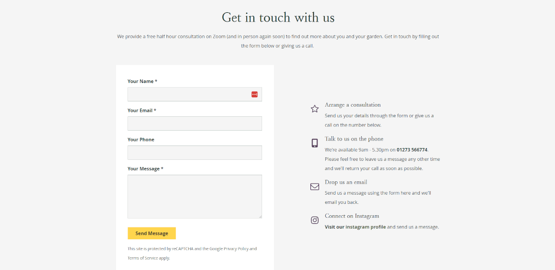
Not everyone feels at home using email. You may find some users prefer the speed and ease of calling you up and clarifying all of their questions over the phone without the back-and-forth of email.
You may also find that some people would prefer to reach out on social media platforms after they’ve browsed your posts and got a better feel for what your business is about.
In some cases, you may even find people would prefer the convenience of knowing where your premises are located and coming to see you in person.
Offering alternative contact methods is important for putting your user first and helping them feel comfortable reaching out. It’s also important to balance how you handle your enquiries, so only include other means to reach out if it’s not going to upset your workflow.
As a rule, it’s best to at least have one alternative means of contacting you; especially when you consider that some users with screen readers may have difficulty completing online forms. This keeps your means of communication accessible to all.
Include FAQs
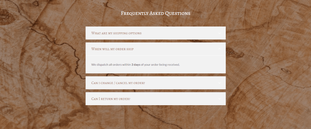
Over time, you’ll find there will be some queries that keep popping up time and time again through your means of communication. This is where a Frequently Asked Questions section can come in handy.
Addressing your FAQs in their own section on your Contact Page is not only helpful to the user, but it can also save you a lot of time having to respond to questions you’ve already answered time and again.
Expanding Blocks on Create are perfect for keeping your many FAQs compact on the page. If someone spots the answer to their question, they simply have to click on the question to reveal the answer.
We don’t want to discourage anyone from getting in touch, but if you can make life easier and save everyone a bit of time by addressing the questions or concerns they likely have, you’ll be offering a much smoother user experience.
Share Testimonials

Any time you want your visitor to commit to taking action on your website, you can consider adding content that will encourage them to do so, around the action button or prompt. Reaching out is a considerably important action and testimonials are an ideal way to put them at ease and take that step.
If you have a glowing testimonial about your shop or service, your contact page will benefit from you including it. Where you can, try to use a fitting testimonial where someone had reached out to you, and you were able to help them.
There’s nothing more powerful for a website than the words of those who have benefitted from what you’ve offered in the past. Testimonials will be one of your biggest assets for building trust on your Contact Page, and elsewhere on your website.
If you don’t yet have any feedback to work with, you should check out our blog on obtaining quality testimonials for your website. You’ll discover some quick tips that you can implement into your client journey to build their feedback into part of your process. You can even use your website to acquire feedback for you.
Wrapping Up
Here’s what to remember when building your Contact Page for the first time:
-
Consider Why & How Users Would Contact You - Take the time to think about what contact methods and information would be useful to your visitor.
-
Include A Form - For many people, filling out a quick contact form and starting an email thread is the easiest way to reach out, so be sure to include one on your page.
-
Keep It Simple - Remember, your visitor has come to this page with one action in mind. Keep your primary contact action at the top of the page and keep content concise.
-
Explain What To Expect - Setting expectations can put your visitors at ease and make your communications going forward more smooth.
-
Outline Other Ways To Contact You - Some people may prefer to call or contact you in other ways. Be sure to offer at least one other option for their convenience.
-
Include FAQs -Adding a section of Frequently Asked Questions can save both you and your visitor time on things you’ve responded to time and again.
-
Share Testimonials - Testimonials are powerful assets that help put your visitors at ease and encourage them to take the next step and reach out.
Your Contact Page is the gateway to new customer / client relationships. Taking the time to refine it to fit the purpose of your users can help improve the number of relationships you begin.
By utilising the tips in this blog and the others on designing your website and building your home page, you should be well on the way to creating a tailored and effective journey for your visitors.
If you’re ready to take the next step, why not check out our tips on building an About Page? You’ll find all the inspiration and ideas you could need to guide your writing and craft a beautiful page.
Want to get ahead and know how to successfully launch your website? You can make sure you never miss a trick by getting our email updates. We share the latest news from our blog along with tips and ideas you can utilise to grow your business online.


