Blog > Designing Your Own Website: Your Guide to Getting Started
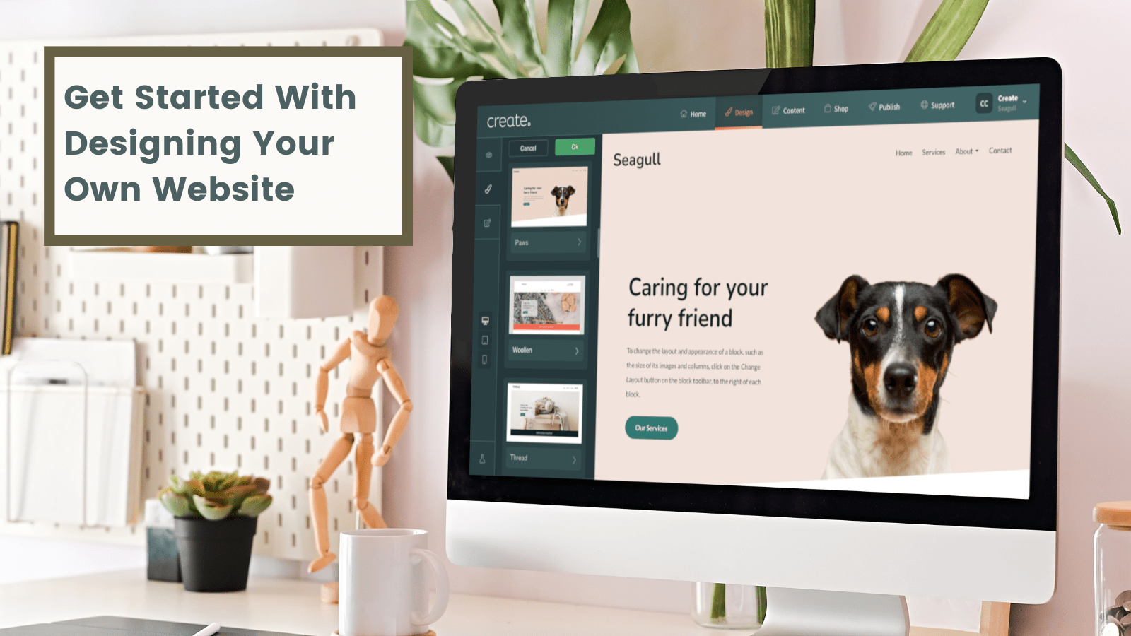
So you’re ready to make your mark on the internet.
Building a website is an exciting and empowering experience. However, this is only after you’ve got the ball rolling.
Getting started is often the hardest part. As you stare at a blank canvas with no previous experience to guide your direction, it can be overwhelming at first.
That’s why we’ve put together our tips and advice on getting started. You’ll find ideas of where to draw inspiration from, as well as finding how to make practical design choices in order to build a website that delights your customers or clients.
Want Your Own Website?Start Building Today!
No credit card needed. By submitting this form you agree to our T&Cs and Privacy Policy.
Before we get started, Ian (one of our Expert Account Managers) has put together a video guiding you through how straightforward it is to pick a website Template and start customising it with your own design styles in Create. Check it out below
Gathering Inspiration
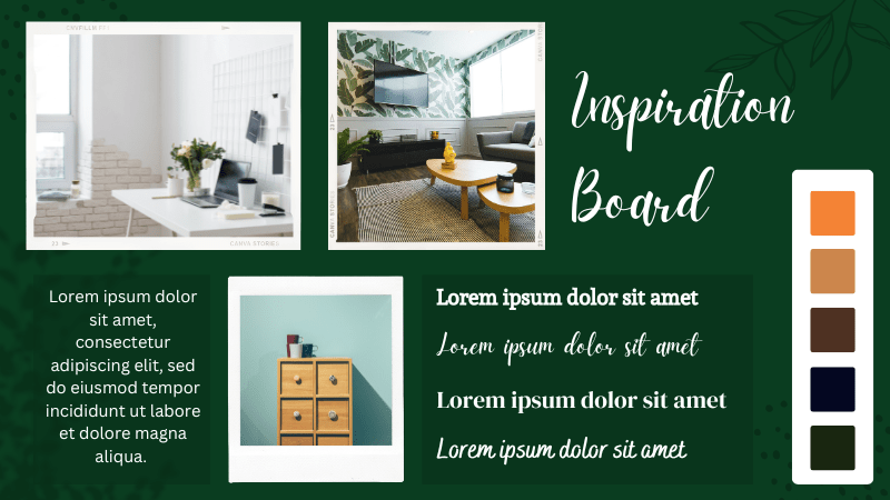
Before you dive into designing your website, it's important to gather inspiration and develop a design plan.
One way we’ve often recommended doing this is to create a mood board.
A mood board is a visual representation of the aesthetic, tone, and style you want to convey on your website. It's a collage of images, colours, fonts, and textures that captures the essence of your brand.
To create a mood board, you simply need to find design features you like and feel resonate with your brand. Once you’ve found them, cut and paste them to your board to try to bring your favourite elements together. You can find inspiration anywhere, from Pinterest to Instagram to industry magazines.
Personally, we love using industry magazines for this exercise. This is because their design team will have invested a lot of time and money researching and developing every design element on the page. Drawing inspiration from these sources, therefore, is much more likely to resonate with your target audience.
When creating your mood board, aim for cohesion. Things may be a bit jumbled at first, but as you move forward, make sure all the images you select work together to create a unified look and feel. This will help you stay focused as you move into the next phase of designing your website.
Collating Resources

Once you’ve got some inspiration behind you, it’s time to make sure you’ve got your brand materials to hand.
It’s important to note, that if you don’t yet have any brand guidelines (a framework that outlines your design choices and helps you to maintain design consistency) and would prefer to see how things take shape, this is completely fine.
However, if you do have guidelines to work to, this can help refine the next steps of the process and make your design work very straightforward.
If you have, or want a logo, now is the time to start thinking about it. This will be a key point that a lot of your design choices will flow around. We’ve detailed how you can start thinking about what your logo needs to be in our blog on How To Design A Logo.
Now is also a really good time to start thinking about what pictures you might like to include on your site that are synonymous with your brand. You can import these directly into your site through our Unsplash Free Image Library. Alternatively, there are lots of royalty-free image libraries where you can start to gather your resources from.
Picking A Template
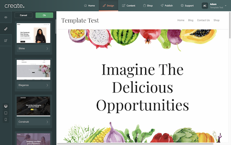
With the preparations out of the way, you can dive straight into building your first website with Create.
The first step you will be prompted to take is to select a Template.
A Template is a preset framework of design choices that will apply to your website. This simply means that it will select things for you such as a colour scheme, font, the header & footer, and in some cases the spacing.
When you select a template with Create, we’ll also create some example page structures to work from so you’re not building from a blank canvas.
Pages are made from Content Blocks and we will lay some out for you to get you started. You’ll see sections of images, text and other items on your page. Everything here can be customised with your own choice of Blocks and the content you’d like to fill them with.
It’s important to note that picking a template is not going to affect what you can do with your site down the line. Many people’s sites end up looking nothing like the template they started with. Everything is completely changeable and you can pick a new template at any time. They are simply there to help guide your creative process.
There are plenty of templates to choose from. We recommend either going with something that looks similar to your brand guidelines, mood board, or industry and starting from there. This should help things to take shape more easily.
Selecting A Header & Footer
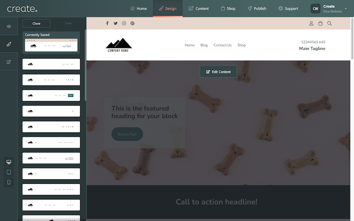
Your Header & Footer are the top and bottom of your website pages. These will be the same across every page of your website.
You can customise your choice of Header & Footer. For example, if you plan to have an online store, you’ll want to include the cart icon and perhaps some account login icons in your header. If you’re a local consultant or tradesperson, you might consider using this space to prominently feature your phone number instead.
Again, this choice doesn’t have to be set in stone, and you can try out more variations later on in your website-building journey. For example, you may find you’re ready to start building an email list later on and so you choose to add a footer that allows people to enter their email.
For now, just choose a style that you like and will suit the needs of your potential customers or clients.
Choosing Your Colours
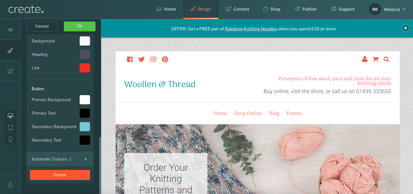
By now your website design should look like it’s taking shape. Please note, that before continuing with your design work, you may find it helps to build one of your pages first so that you can see how the content fits together with your design choices.
Choosing a colour scheme that works can be tricky, but there are several ways that you can approach the task.
You may already have an idea of what colours you’d like to use. If there is one in particular (for example, a prominent colour in your logo) you can use this as a base colour in Adobe Color. This will recommend a selection of complimenting colours you can use in your site.
Another method to find a colour scheme that works is by using an image you’ve found. Using Canva Color Palette Generator, you can upload the image and it will pick out key complimenting colours from this image that you can use.
Of course, you can also feel free to experiment with different colour combinations within Create. Find out all about creating a colour scheme in Create >>
Finding The Right Fonts
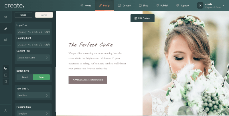
The last big design choice to consider are the fonts you will use. You may have already found some examples that you like, but before diving in, there are some best practice guidelines to follow.
Certain fonts can appear smaller and harder to read on screen than others. The more decorative font types are generally better suited when used sparingly for things like large headings.
The best fonts to use for the main text on your site are modern fonts such as Arial, Tahoma, Trebuchet or Verdana. These will be much clearer for your visitors to read, as they were designed for use on computer screens.
If you’d like to adjust the size of your text, there is an option to apply this globally across your website in the Design screen. Alternatively, you’ll find heading and content sizing options on each Content Page if you’d like to make certain headings or passages on your site pop.
Wrapping Up
Just like that, you will have taken the first step towards creating an online presence that reflects your brand, ideas and values. Building a website can seem daunting, but with the right inspiration, resources and tools, you can design a beautiful and functional site that your customers and clients will love.
By building a website with Create, you can craft pages with Content Blocks that are easily customisable, allowing you to focus on what matters most: delivering an experience that captivates and engages your visitors.
Want Your Own Website?Start Building Today!
No credit card needed. By submitting this form you agree to our T&Cs and Privacy Policy.
Don't be afraid to experiment, to try new things and to think outside the box. Building a website should be a reflection of your brand, your values and your vision for the future, but it is also a creative process. No one gets everything perfect the first time around - so go ahead and make your mark on the internet, and let your website be the gateway to your success!
Want more tips and ideas on how to start and grow your website? You can make sure you never miss a trick by getting our email updates. We share the latest news from our blog along with tips and ideas you can utilise to grow your business online.


