Blog > How To Structure Your Coaching Website Home Page
Posted By Create

If it’s your first time building a website, you’ll undoubtedly be excited to get stuck in. There’s so much to explore and plenty of creative freedom to unleash what best represents your business online.
Of course, it comes with its own set of challenges too. A blank page can be an overwhelming prospect and having never created a web page before, where do you begin?
The best place to start is your home page. An essential for any website that will help introduce your coaching business and guide your visitors on their journey towards make an enquiry.
If you haven’t yet planned out what pages you’re going to need for your new website, this is the first step before tackling your content. Discover the winning format you can work from in our blog: How To Build A Successful Coaching Business Website >>
A website builder such as Create will help you enormously with building your pages. We have page presets to help you get started and hundreds of Content Blocks to structure your content with.
However, in this blog, we’re going to be getting pretty granular if you find yourself truly stuck for inspiration. You’ll find an exact template you can follow to get started and expand upon if you so choose.
I’ll go through with you how this home page works and why; so you can move forward with these concepts to create the rest of your site.
The demonstration site we’re using was built with Create and is at clarity.create.net if you’d like to check it out.
Introduce Your Business
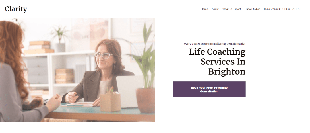
Priority number 1 for when anyone lands on your home page is to let people know they’re in the right place. This priority is then very closely followed by “make it exciting”.
Attention online can be fleeting unless you learn how to welcome visitors to your site properly; so you need to know how to put your best foot forward.
Start by figuring out how to describe your business in a single sentence. You should add what makes you unique and stand out from the competition as well as what you actually do.
For instance, the following sentence may be useful for SEO purposes:
“Life Coaching Services In Brighton”
But it doesn’t really inspire anything within the hearts of your potential clients. Instead, you could try something like:
“Over 25 years of experience delivering transformative life coaching services in Brighton”
The latter sets you apart from those (the competition) who may be newer to the industry, while also being more emotive and informative. You can set yourself apart in many ways, whether it’s a new take on traditional practices, awards that you’ve won or any other unique selling point.
When you have your introduction written out, you need to make it striking to capture people’s attention and lead them down the page. You can use Create’s Content Blocks to lay your content out beautifully and use the free image library to source photography and graphics for your website".
You’re aiming to let your visitors know they’re in the right place and get them feeling excited about what you have to offer. Don’t worry about getting everything perfect the first time around. With website building, the best improvements you’ll end up making are based on what you learn from people visiting your site after it’s published anyway!
Outline Your Services
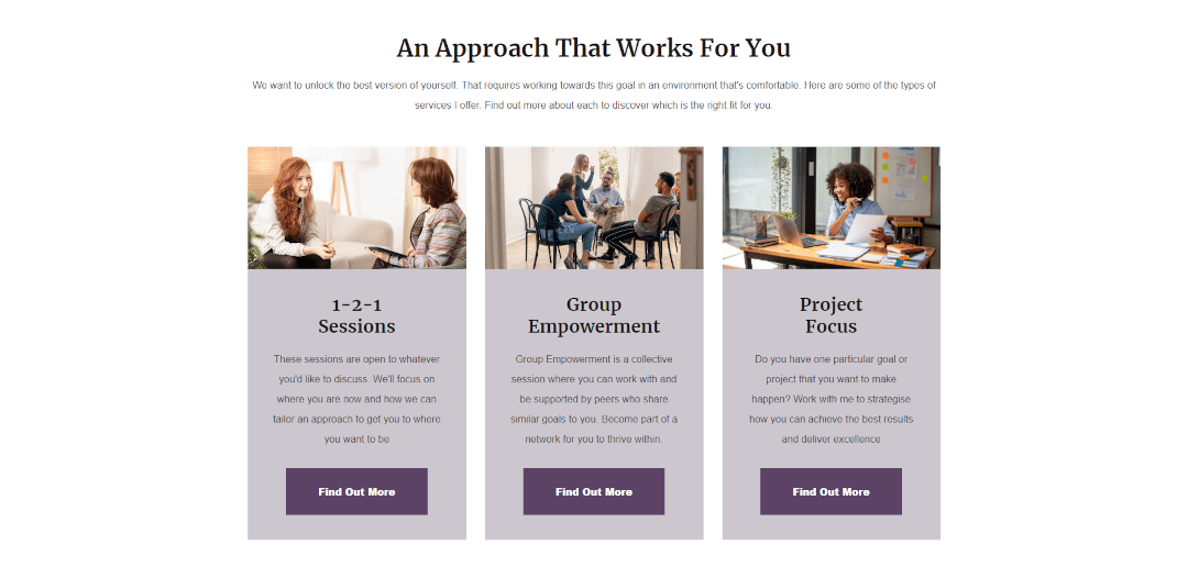
Once you’ve hooked your visitor, they will be eager to know more about your service. Let’s give the people what they came for and outline the services you offer in the next section of your page.
If your service is a one size fits all approach, you may want to outline here what your clients might expect from your service. However, if you offer multiple services or tailor your approach to different situations, a Collection Block will be ideal here.
A Collection Block allows you to build a row (or rows) of separate sections (as you can see in the image above).
You can break down what you offer in a simple and easy-to-digest format that prompts visitors to take the next action. Be sure to keep everything bite-sized here and link through to more information about each section or service using a Call-To-Action (covered more at the end of this article).
Feature Testimonials
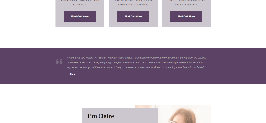
There’s nothing more powerful on a website than what previous clients have to say about their relationship with you - or further to that, exploring how you’ve helped your clients in detail through case studies.
People want to hear stories that they can relate to. They want to see how you’ve helped others so that they can pick out parts of their own story. This helps them to decide if you’d be able to help them in the same way as you have others.
There are plenty of Quote Block options to present and highlight individual testimonials on your home page beautifully. If you have case studies you’d like to build into your site, another Collection Block could be the ideal way to link to these pages.
If you don’t yet have any feedback to work with, you should check out our blog on obtaining quality testimonials for your website. You’ll discover some quick tips that you can implement into your client journey to build their feedback into part of your process. You can even use your website to acquire feedback for you.
Introduce Yourself
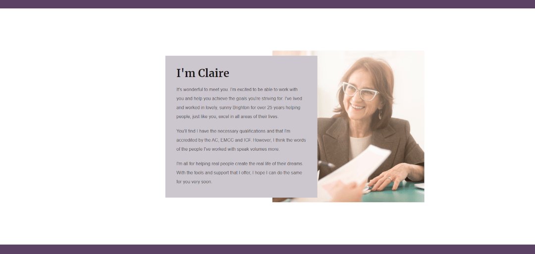
When promoting your coaching business, there is one key selling point above all others… You.
You need to make sure you dedicate a section on your home page to you; who you are, what qualifications you have, what you do, etc.
Your website visitors will be looking for this information. If they’re going to dedicate time and money over the course of months to working with someone, they want to know who that someone is right from the outset.
Ensure you include all your credentials (you can even include relevant accreditations using the Logo Block) and an image of you. This will make a huge difference in building trust and credibility.
People want to see who they’re working with. If you don’t have a picture you’d be happy to use on your website yet, it is well worth investing in having one taken professionally!
Call-To-Action
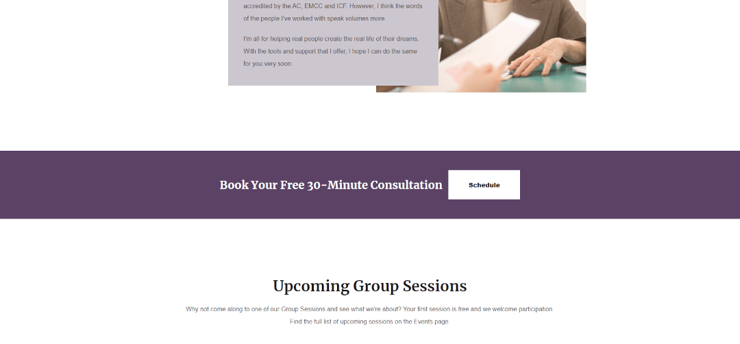
At every stage, you should consider your website less as a collection of pages, and more as a journey leading your visitors to take an action. This action will most likely be to book an appointment or make an enquiry on your site.
So if each page is a step in the right direction, you need a prompt to encourage people to take that next step. This is a call-to-action (CTA) and it usually takes the form of a link or a button on your website pages.
Your page should already have some relevant CTAs throughout. For example, you might have linked the Collection Block of Services to pages that explore them in more detail. You may have linked your section introducing yourself to your About Page.
The key is it should be relevant and move your visitors closer to taking action. You can read more about this concept in our blog on Website Objectives.
If someone has read the entirety of your home page and reached the bottom, that’s a very solid indication that they are interested in what you have to offer and they’re ready to take the next step. Be sure to include a prompt to take action here.
More Relevant Content
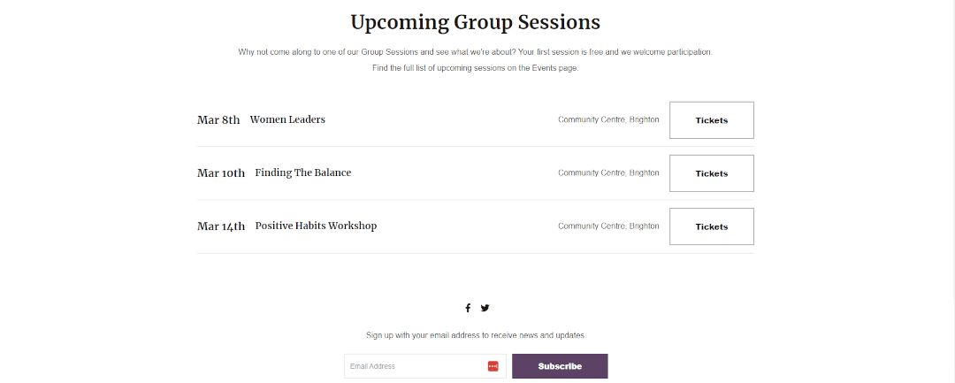
There may be other resources you’d like to include on your home page that could be relevant to your user's journey. For example, you may offer them the chance to subscribe to your email newsletter. There could be upcoming events or group sessions that enable people to get to see you in action. Maybe there’s content on your blog that is perfect for new visitors to get a taste of what your service is about.
These pieces of content aren’t necessarily part of the core journey through your website. They’re not essential in order to get someone to enquire, but they can be supplementary to that goal and increase the chances of people coming back to your site.
If there are sections like this you’d like to add, they fit best at the end of your home page. Think of it as prioritising the order of the content of your page, so that the highest converting content is at the top.
You may also consider adding your pages that go into more detail about your services or features to your website footer. This means they’ll be available on every page your user visits and accessible at all times for people who are interested in finding out more.
In the example above, we’ve included a timetable block of upcoming events people can turn up to. While this content is less likely to get them to book a 30-minute call on this website, it’s still an excellent way to encourage them to take action and meet you in person; which will hopefully lead to acquiring another happy client regardless!
Wrapping Up
If you’re just starting out with building your home page, here is one way you can structure your page to inspire your visitors to become clients:
-
Introduce Your Business - Summarise what distinguishes your business from the rest in a single sentence and make it BOLD.
-
Outline Your Services - Start exploring, for your visitor, the types of options your service provides and link them through to more information about each.
-
Feature Testimonials - Nothing builds trust like the words of people who have used your service previously. Show off your testimonials and case studies.
-
Introduce Yourself - Your potential clients need to know who they’re committing to working with. Feature your credentials and show your face!
-
Call-To-Action - What’s the next step your visitor needs to take on their journey to becoming a client? Prompt them and link them through to this next step.
-
More Relevant Content - Content that is supplemental but not key to a client’s journey belongs at the bottom of your page or in the footer.
If you follow this format, you’ll be on the way to having a winning home page that delivers you clients. The rest of your pages should follow more easily. You can find out what kind of pages you might need in our blog about building a coaching website.
Just remember to keep in mind what the objective of your website is, how each page fits into that and how you can inspire action.
If you’re pondering your next step, why not check out how to build an About Page? It’s perfect for building trust with your potential clients and helping them feel more comfortable reaching out.
Want to get ahead and know how to successfully launch your website? You can make sure you never miss a trick by getting our email updates. We share the latest news from our blog along with tips and ideas you can utilise to grow your business online.


