Blog > 6 Principles to Elevate Your Website Design
Your homepage is naturally one of the most important pages on your site.
No doubt it’s many of your user’s first impressions of your website and your business. Therefore, the main job of your homepage is to introduce the problem you’re solving, connect with who you can help, and then to guide those people that fit towards the action they are on your website to take.
This is important to consider when thinking about your homepage design.
When you look at your home page does it do this effectively?
Even if you think it does, it’s worth keeping the following in mind any time you’re making changes or re-designing:
-
Who is my ideal customer?
-
What need do I fulfil for them and why are they looking on my website?
-
What do I want them to do on my website? (Fill out an enquiry form, buy something, pick up the phone or visit my store are a few of the usual ones).
With the above in mind also consider the following:
-
Does my home page represent my ideal customer? Can they see themselves there in the imagery, using the products, enjoying the service?
-
Does my home page messaging convey how I can solve their problem and make their life better?
-
Does my home page make it clear what I want them to do and easy for them to do it?
Good design can elevate your site and make it work better for you.
It can make you look professional and improve the experience your customer has and the impression that you make on them. Even if some of this will be on a subconscious level.
Here's how some tips on how to execute this:
Symmetry
This makes things more appealing to the brain. When content is laid out clearly the brain will find it more balanced and easier to understand. As a result your website will also look more professional.
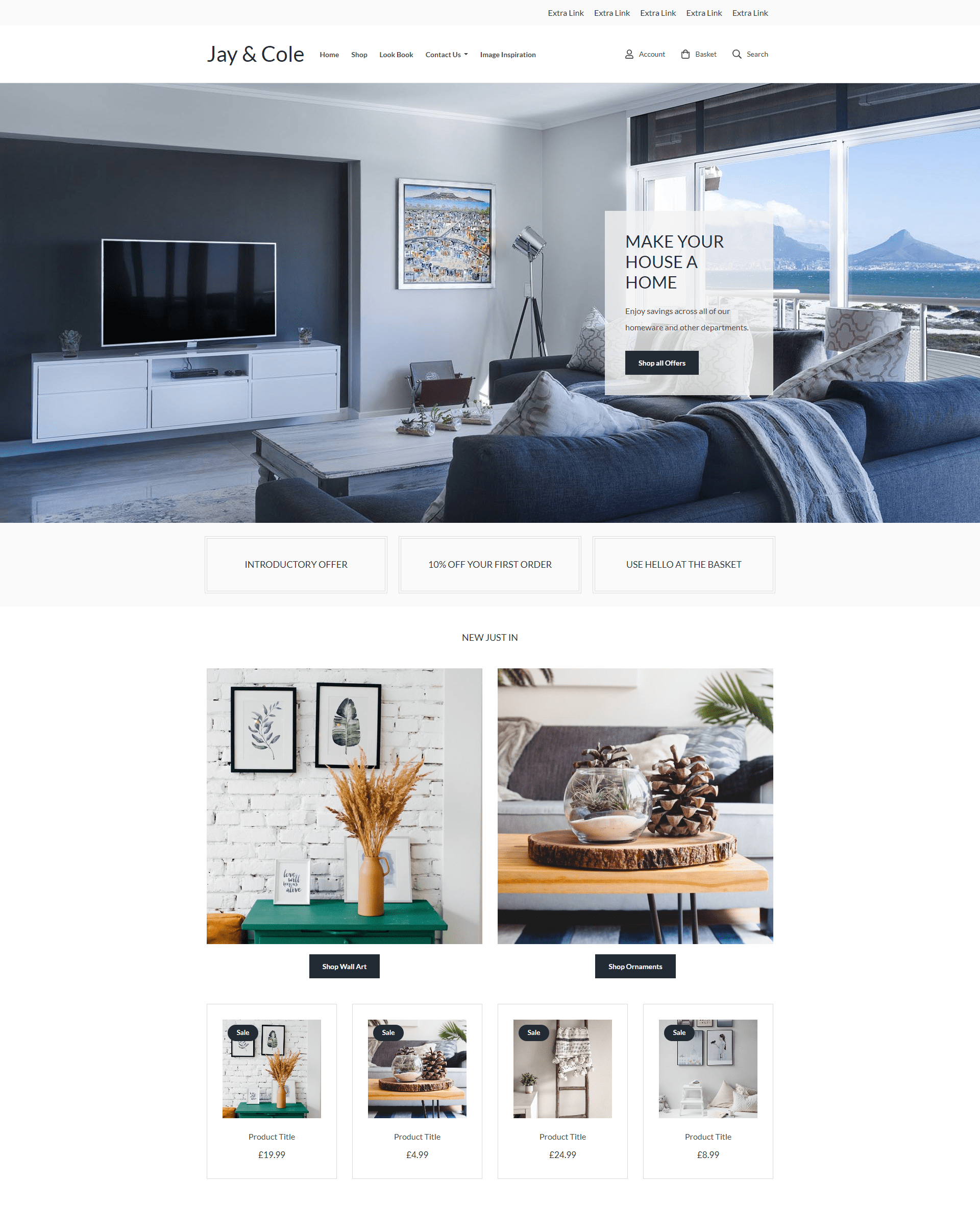
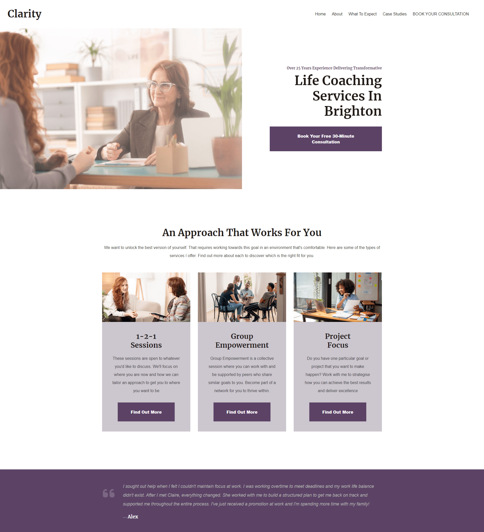
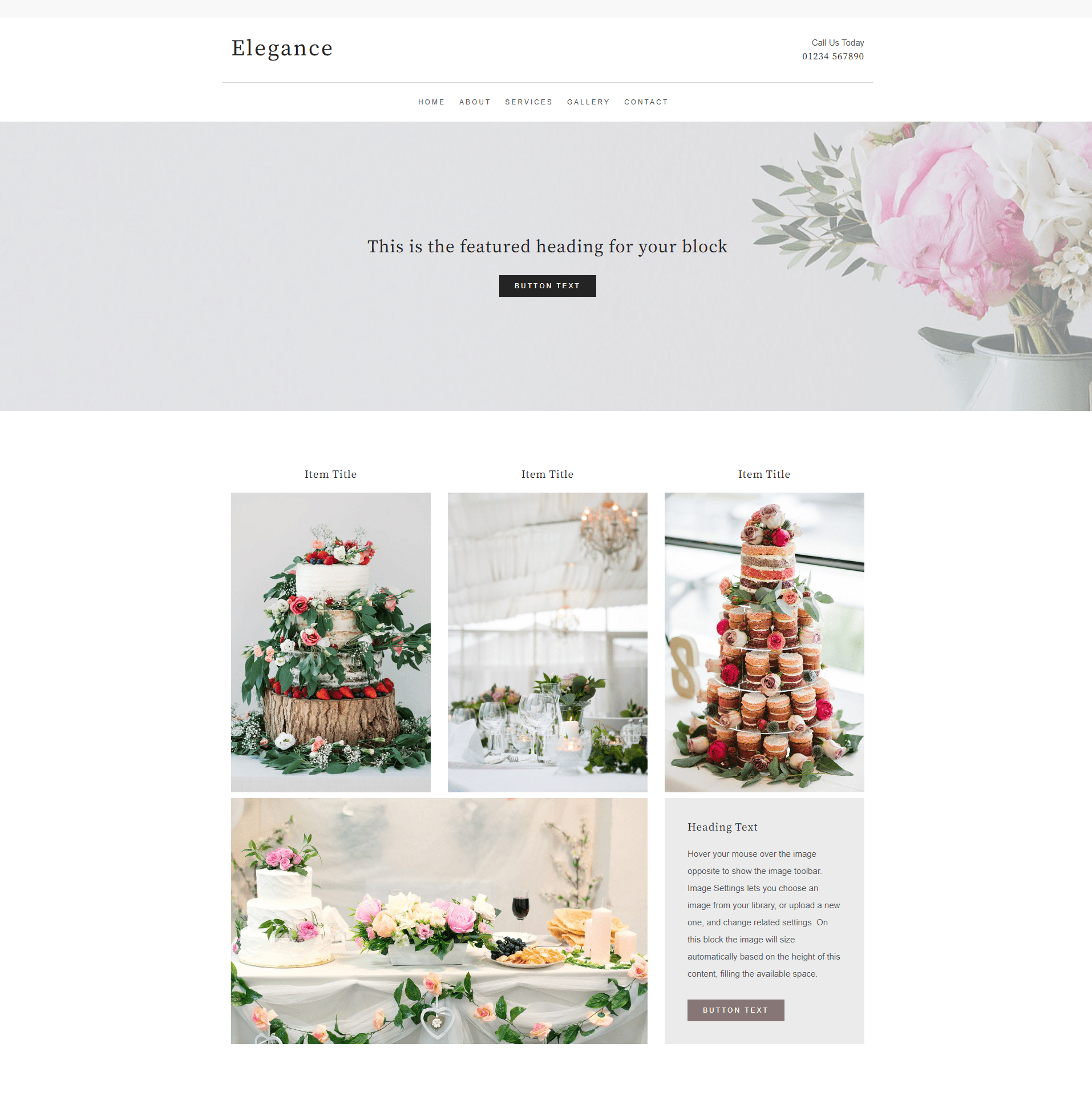
Create’s Content Blocks make building symmetrical pages easy. Simply drag and drop the Content Block you’d like to use onto your page and the system will help you to position all the elements on your page.
Repetition
All the blocks you use to design your Create website have been created with matching spacing and padding to automatically create a more designed feel for your website. Choosing to use the same blocks throughout your website helps the visitor to feel continuity across your pages.
QUICK TIP: Favouriting your blocks is a great way to keep track of ones you're using or like. Just choose "My blocks'' from the menu to find them.
Consistency
Maintaining consistency across the layout of each of your pages or groups of pages is an important way that you can reduce unnecessary burden on the brain of your visitor. This can happen when the look of something keeps changing.
QUICK TIP: Consider using the "Duplicate Page" option to build a new page based on one of your existing ones.
Limit Your Colours
Using a limited colour palette and fonts can bring things together. Repeated content styles help the brain to look at the information that matters and not be distracted by changing designs.
You want the visitor looking at what you've put on the website - your art, photos and information. Let the colours and design support this, not crowd it.
Uniformity
Make images that are displayed together the same size and aspect ratios, this helps create uniformity and is pleasing to the brain of the visitor. It also helps to ensure the spacing around your content is even.
Adjusting an aspect ratio is easy in Create and for many Blocks, we’ll take care to make sure everything is uniform automatically.
Space
Finally, don’t be afraid of space and simplicity. Too many design elements can be overwhelming to your visitors and can detract from their experience of your site. You’d be amazed by how much of an impact adding a bit of space around your text and images can have.
You can adjust this in your Block Settings using the Padding option. Just remember the previous tips and make sure you keep your spacing uniform across your Blocks and pages.
Wrapping Up
Ultimately, great design doesn’t need to be complicated. In many ways, by keeping things simple, you’ll support your content and create more impact.
By utilising these 6 principles, you’ll enable your content to stand out while helping your website visitors absorb the information you share with them.
Of course, website design is a lot easier with the support of a content building system. That’s what we offer at Create. Our goal is to make building a website easy and accessible to any small business owner. You can start your free trial here and see for yourself.
Want more tips and ideas on how to start and grow your website? You can make sure you never miss a trick by getting our email updates. We share the latest news from our blog along with tips and ideas you can utilise to grow your business online.


