Help Centre
Over the last few years we’ve created a variety of content blocks to help you design different content quickly and make your site unique. But, as this selection grew, discovering Blocks became harder and took more scrolling to find the ones that work best for you.
This release introduces a number of updates including new ways to find and choose the right Content Blocks for your pages.
As you start exploring what’s new you’ll also discover that you can turn a Collection Block into a Carousel, get specific with the size of your images, and design with new styles of content. You no longer need to choose from the long list of Block variants either. You’ll find a new menu for choosing column layout and alignment that makes this option visually easier to understand and quicker to find what you need.
Read on to find out how these features work and what they can do for your website.
Content Block Filters

When you next add a Block to one of your pages you’ll notice the drop down box for picking your Block has been replaced with a panel of filters. These new filters will enable you to quickly drill down on the Block you’d like to add using different criteria.
You can choose Blocks based on the “elements” you want them to have, from images and text, to buttons and maps, or based on what you want to use them for, such as displaying text, an image gallery, a features list or a client quote.
You can also combine your purpose with how many columns you want the Block to have and easily narrow down to exactly what you’re looking for. It’s no longer necessary to scroll through the variations of a Block as the filters will bring up all of these.
Read more about Content Block Filters >>
Block Layout

Changing the layout of a Block, such as its size, margins, and column widths is now just a click away on the Block toolbar of every Block on your page.
For Blocks with multiple columns you’ll see a visual representation of the different column sizes, layouts and alignments available, and can instantly see how they will affect your content.

For item collections, such as the Image Gallery or Meet The Team Blocks, you can quickly change the number of columns shown.
Read more about Block Layouts >>
Carousels
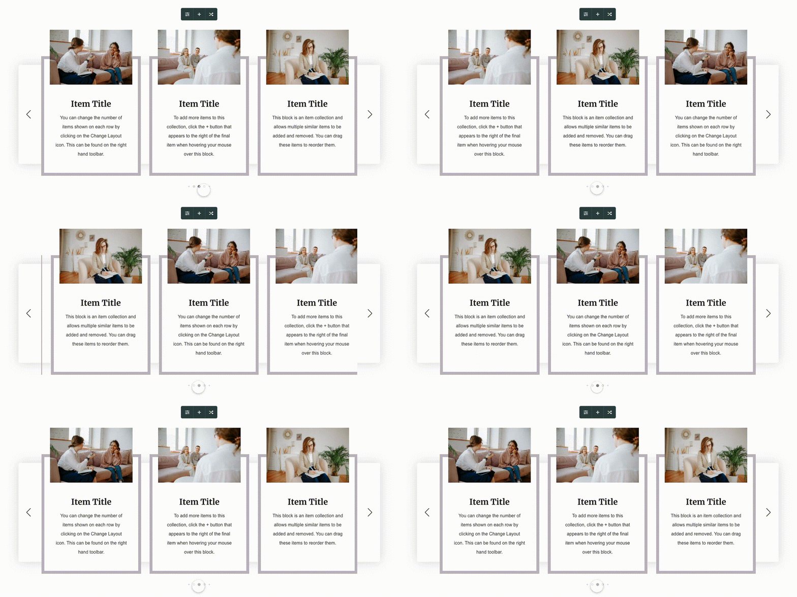
Almost any “Collection” Block can now be turned into a scrolling “Carousel”. This can be a great way of displaying large amounts of content without taking over the entire page. It’s also an engaging way to create movement on your page that attracts the visitor’s eye. In the above example we’ve used it to showcase new products, but it’s also great for events and news.
Read more about Carousels here >>
Image Sizing

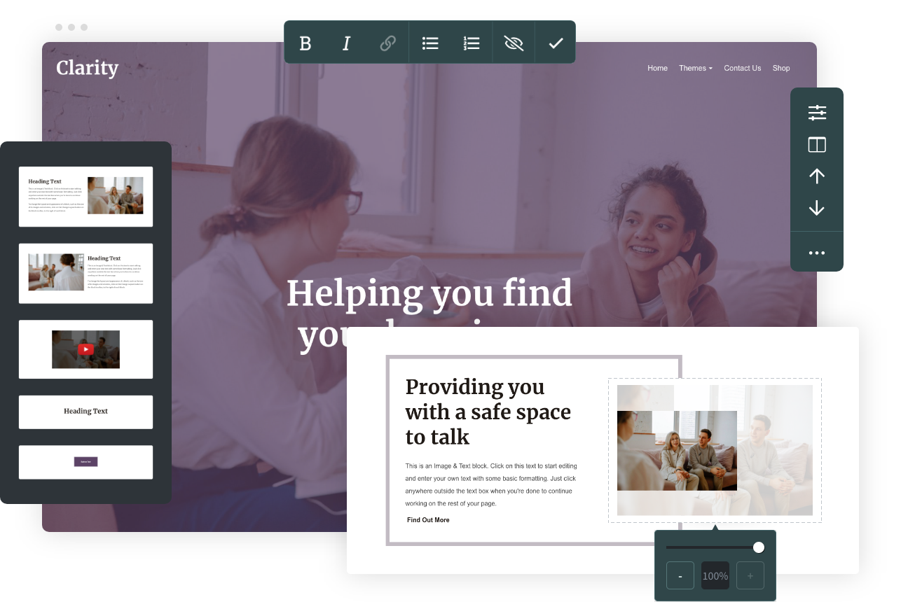
You now have two new options giving you greater control over how your images are displayed. On the toolbar that appears when you hover over an image, you will now find a new “Image Size” option that lets you scale an image between 50% and 100% of its original size.
This new tool will work on any image on your site, including your logo if you have uploaded your own. Simply head to the Design tab and go into your Header settings. You will find the same option appears when you hover your cursor over your logo.

Additionally, at the bottom of the “Aspect Ratio” drop-down, you will see a “Fit” or “Fill” option with which you can choose whether your image is cropped to fill the available space, or resized to fit within it.

New Blocks and Styles
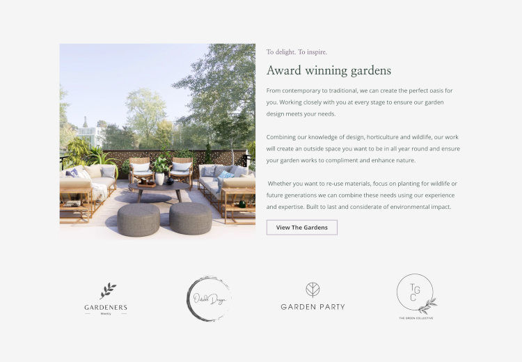
There’s also a range of new Content Blocks and Style options. From the Logo Block (shown below) to a host of newly designed Image and Text Blocks.
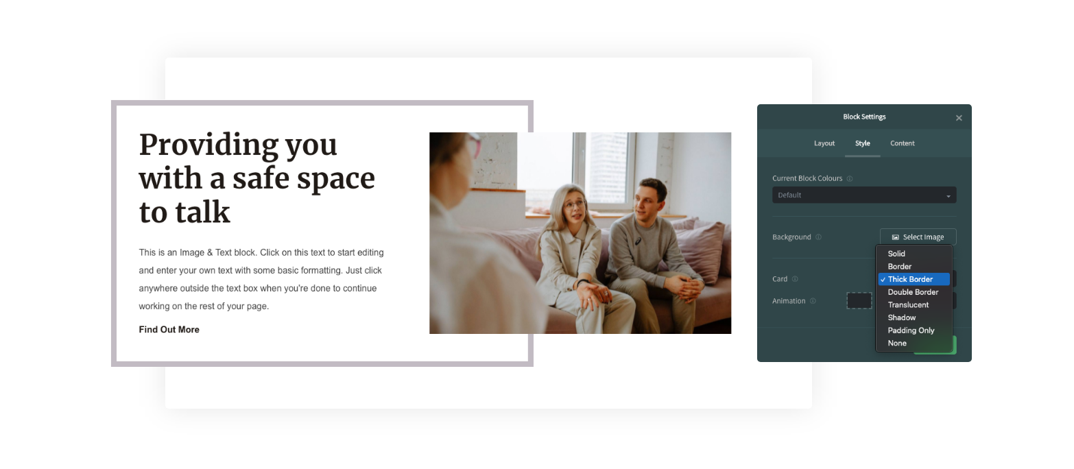
More Card Styles have been designed to give you new ways to accentuate your content and draw the eye of your visitor to what’s important.
There are more ways than ever to bring your unique style and brand into the design of your website with this release. It also paves the way for more new features over the coming months to give you even more design power at your fingertips - so watch this space!
Simon Kimber, our Co-founder and CTO, had this to say about the new release.
“Over the last few years, since the original release of Content Pages, we’ve taken every opportunity we can to watch people use the tools in real world situations.
We paid close attention to the places where users could not easily see how to do things or work out where things were, and those observations and feedback have been the driving force behind all of these updates.
The initial reaction from users who have had early access has been fantastic, so I’m really excited to get these improvements into the hands of all our users and see the amazing pages they create!”
You can get started right away with all these new features in your Create account. To learn more about using the features above, check out our guides below:
If you’d like to hear about future updates available on Create, or to be invited for early access to some features, subscribe to our emails to be the first to know.
Related Articles
More Questions?
If you have any further questions, please get in touch and we will be happy to help.
Get in Touch

