Help Centre
It’s a great feeling when a sale happens on your website. Every business owner wants to get people through the checkout process. However, it is not uncommon that many potential purchases end up turning into abandoned baskets.
The average cart abandonment rate was measured at 70.19% for 2024
You can send Abandoned Basket Recovery Emails to claw back at this percentage, but wouldn’t it be fantastic if you could make checking out so easy for your customers that the number of people abandoning their baskets naturally begins to decrease anyway?
It has been found that 22% of US online shoppers have abandoned an order in the past 4 months solely due to a “too long / complicated” checkout process. With the Create checkout, we have simplified the entire process with a structured, logical design.
Our checkout has been optimised to adapt to your customers' device and provide the best experience for them whether they are using their mobile, tablet or desktop
What’s Included?
When customers are browsing your shop, they’re inspired and excited about the prospect of owning your products. However, It is during the checkout that life tends to get in the way. Visitors are more inclined to get sidetracked or put their purchase aside for later. The key to a great checkout is to make the transaction as fuss-free and pleasurable as possible.
When building our checkout, we systematically looked at the factors that could lead to abandoned baskets, such as clarity of information, complexity, transparency and more. We then looked to craft a checkout that addresses each of these concerns so that your customers can enjoy the best user experience a purchasing process has to offer.
The Create checkout features:
-
Product Thumbnails throughout the checkout
-
A complete breakdown of the price will be provided throughout the checkout.
-
Mobile optimisation
-
Last-minute quantity adjustments
-
Optimised data entry forms
-
Simple Discount Code activation
-
Tailored ‘Thank You’ page
More and more people are using their smartphones to browse and make purchases online. This is why the move towards having a responsive website is so important. This is the reason that Google has made the change to mobile-first indexing and why we have been releasing so many new features that are geared towards helping you be mobile-friendly!
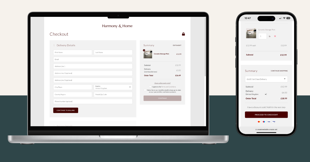
Our checkout has been optimised to deliver a complete, mobile-friendly experience. No matter what device your customers are ordering from, the process will be easy to complete and frustration-free.
The Basket
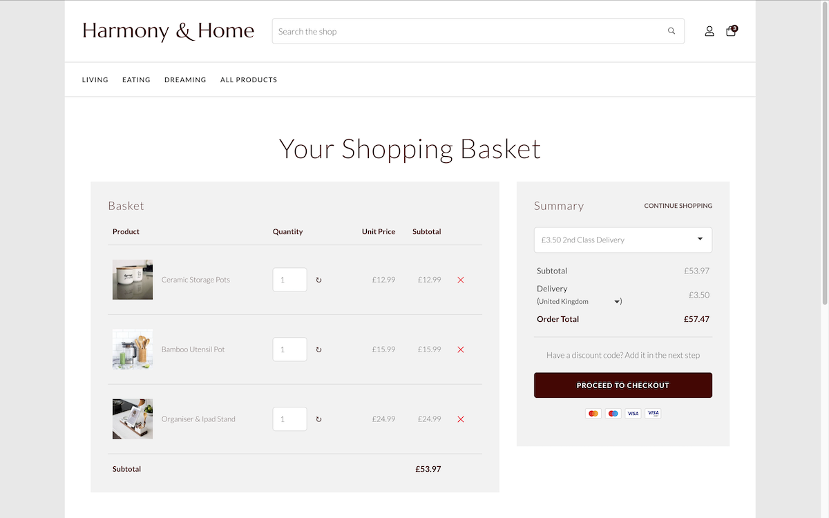
The shopping basket allows users to see what they have added and quickly amend anything before placing their order. It allows them to adjust quantities of any given item and set their preferred method of postage.
This page displays your product images next to the product name, providing a helpful, visual reminder to your customers of what they have added to their basket.
A matter of importance in any checkout is how transparent the process is. Many buyers become agitated when they find that there are additional costs as they go further into their purchase. In fact, a study found that 48% of people abandon their baskets when they discover extra costs in the checkout process. The Create checkout eliminates this irritation with a complete breakdown of cost on the summary panel before they even begin to enter any information.
The Checkout
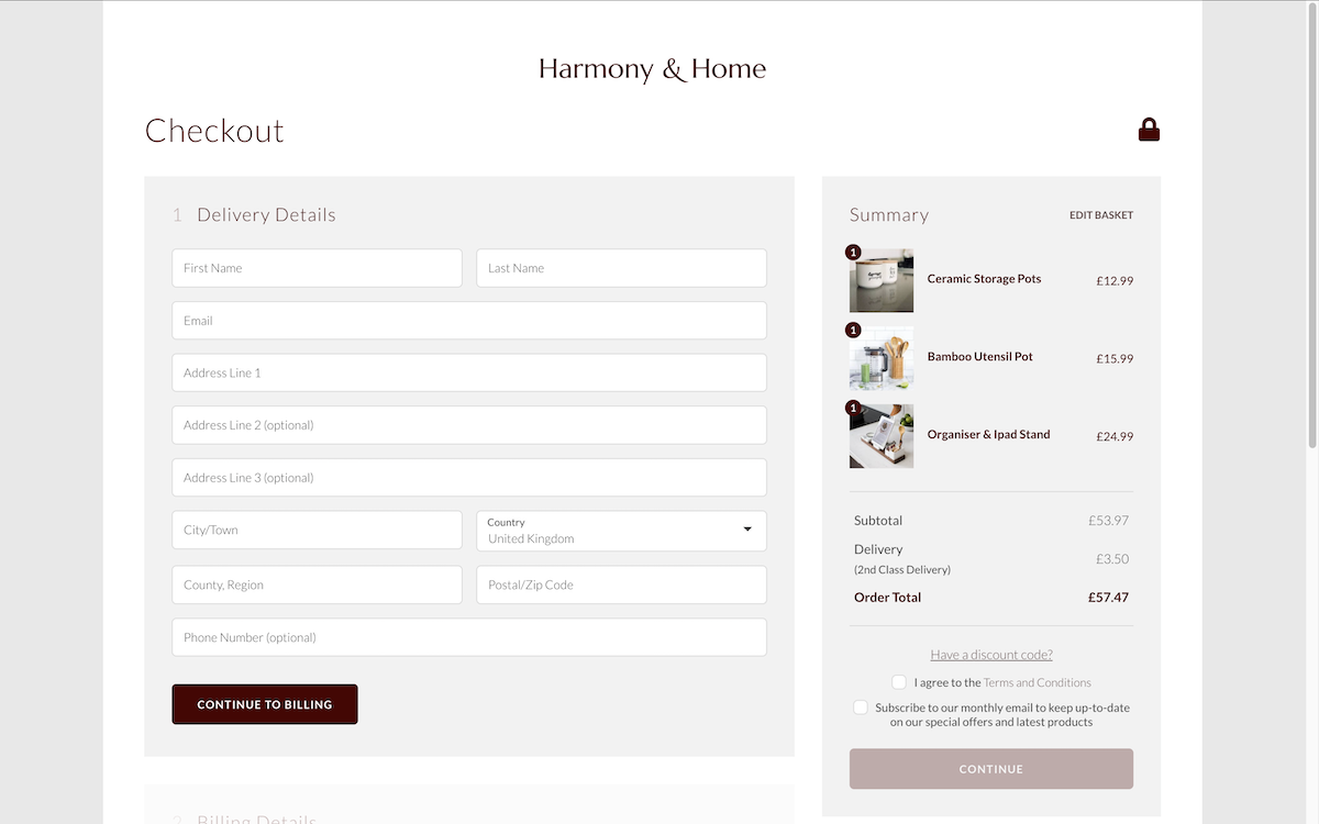
The checkout is broken down into simple stages: Delivery/Billing Address, Postage and Payment. Your customers are able to systematically work through each of these stages and review all of their information in one place.
Another common frustration at many checkouts is when a user will work their way through a form to find they have either missed information or entered it wrong. This then means they need to navigate back through the checkout to locate the error or, in some cases where a page might refresh, having to start the process all over again.
Our checkout addresses this by making sure that each of these three stages is completed correctly before allowing the user to move on to the next and that there is a simple edit link to make changes. This step-by-step process will help your users to review their information efficiently.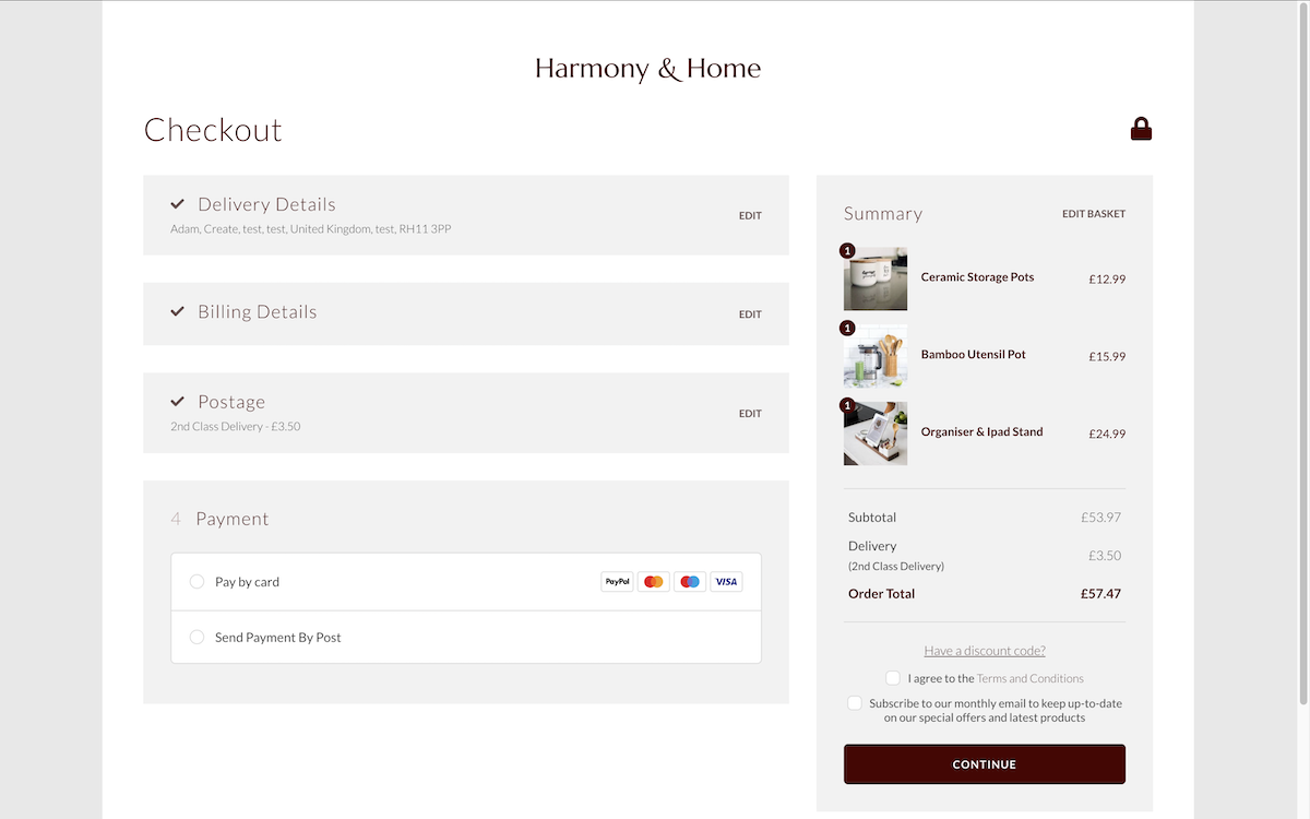
The summary panel features prominently throughout, still displaying your product thumbnails and a complete breakdown of the order.
The summary panel also allows your customers to apply any discount codes that you have offered to them at the bottom of the tab. Any code that is applied here will adjust the order total so that there is no confusion as to whether or not the code has been applied.
Confirmation
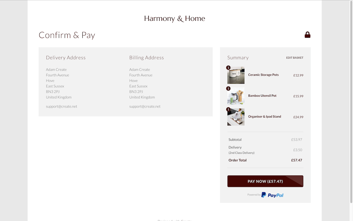
The final stage of the checkout offers your users one last opportunity to double-check their details before moving ahead with their preferred method of payment. This process will then be determined by the payment options you have set up on your website. Create is already integrated with a range of secure checkouts to enable you to accept credit and debit cards through your store.
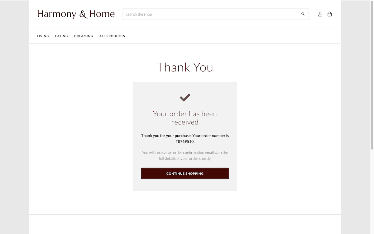
Once the checkout process has been completed, your customer will be thanked for their order on the next screen. They will be provided with their unique order number and informed that their confirmation email will be with them shortly, before directing them back to your shop.
If you have any questions about the Create checkout? We’d love to help! Contact us with any queries and we will get back to you as soon as we can.
Related Articles
More Questions?
If you have any further questions, please get in touch and we will be happy to help.
Get in Touch

