Blog > How To Design A Logo
Posted By Create
Great, memorable and recognisable logos aren't just for big brands with millions of pounds to spare. With a bit of brainstorming and sketching it's possible to create a unique design that tells your audience the story of your business in a split second.
Here we'll be looking at why having a good logo is important for your business and brand and what a successful logo should consist of.
What is a logo and what does it represent?
The first step to creating a good logo design is to understand what a logo is, what it represents and what it is supposed to do. A logo reflects your business’s brand and identity with the use of shape, font and colour.
Reflecting your company brand
Creating a logo isn't just about designing a pretty image, it's a big part of developing your brand and communicating the identity of your company. The first step in creating a logo design should be researching and brainstorming. Before you begin any of the design elements of your logo you should take the following question into inconsideration:
What does your logo need to say about your company?
To answer this question you need to ask yourself who your ideal audience is and what image you want to present to them. Are you a hard-nosed professional or a crafty creative? What's unique about your company? What story do you want to tell your audience about yourself? How can you reflect this in your logo design?
By answering these questions you can learn what important visual elements you want to include in your logo designs that will reflect the company in the best way. Brainstorming lots of ideas is always very good as this will create a strong concept for the logo. If you’re finding it hard to come up with ideas, use keywords and try searching Google images for inspiration. Try not to imitate another logo design but use it as a starting point.
What a logo needs to be
- Descriptive
- Memorable
- Effective without colour
- Scalable
- Able to work on dark or light backgrounds
When you start designing your logo, keep these points in mind. They will help your design become more effective. For example, if your logo is printed in a monochrome newspaper you'll be glad it was effective without colour, and if it's ever shown particularly small you'll be happy you made it scalable.
Take a look at Twitter's current logo below - it ticks all the above boxes.
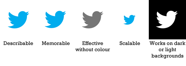 If you take these key points into consideration when brainstorming your design, the final outcome will be a recognisable logo that can be used in a huge variety of places.
Simple design
The design of your logo doesn’t need to be overcomplicated. Try to keep it simple - simple designs can be very successful as they are easy to describe and are memorable. Keeping the design simple will also make it less likely to lose detail when its size is adjusted.
Below are some great examples of immediately recognisable, simple logos that work excellently when made larger or smaller.

Using colour in your logo design
As I've stated above, logo designs need to work in black and white as well as colour. With this in mind it's better, if possible, to use solid blocks of colour rather than gradients, as these are much easier to translate to black and white.
Make sure the colours you choose are in line with the colour scheme of your brand and website. In fact, many companies decide on their logo first, then pull a colour scheme from that to use on their website and other promotional materials.
Typography
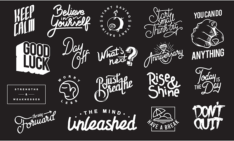
Typography is central to good logo design, and until you're as big as Apple or McDonalds it's likely that you'll need to include your company name in your logo design. Don't be tempted to make your logo design stand out by using gimmicky fonts like Comic Sans, though. Using a tacky font can reflect badly on your company, so keep your font choices simple and clear. It's best to design your own font or have one created for you, as this will help give your brand a certain uniqueness.
Sketch your ideas out
You don’t need to be an artist to realise the benefits of sketching. Ideas can flow much faster between a pen and paper than they can a mouse and monitor. It's good to do some quick draft sketches as you'll be able to tell with far greater ease what works and what doesn't.

If possible, show your logo design sketches to your friends, asking them to tell you honestly what the images make them think of and what feelings they evoke. You might be surprised what you don't see when working so closely with something, and it's better to find out your palm tree looks like a firework at this stage rather than when you come to put the design together digitally.
Create your logo as a vector
After coming up with a few sketches the next step should be to start making your chosen logo into a digital format. Whether you are creating your logo yourself or you have a graphic designer creating it for you, it's best to make sure the final product is in the form of a vector file.
A vector image is one that is made up of points, curves, shapes and polygons. Because these can all be worked out mathematically, the image looks exactly the same when it is blown up to a huge size or reduced to a thumbnail.
Having your logo made into a vector gives you the advantage of being able to resize it without losing any detail at all.
The evolution of a logo
Even when you've finished your logo and proudly plastered it all over your website and promotional materials, bear in mind that it's highly likely that you'll need to revisit and redesign it from time to time, in order to keep up with design trends and the types of designs used in your industry.
I'm not suggesting you should change it every week, but keep in mind that you'll want to prevent your logo from looking old and dated, so it's definitely worthwhile keeping an eye on your competitors.
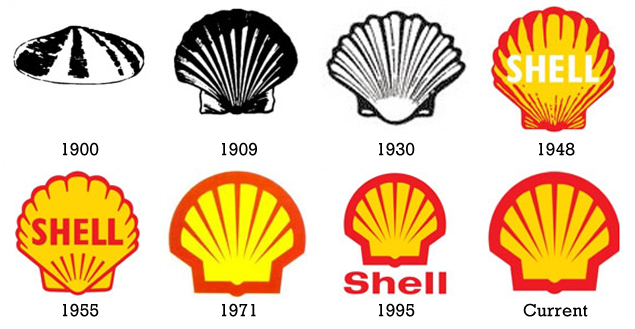
For example, the Shell brand logo below started life way back in 1900. The design is a simple clamshell, and although it has retained this essential, memorable symbol, over time changes have been made to keep it fresh and modern.
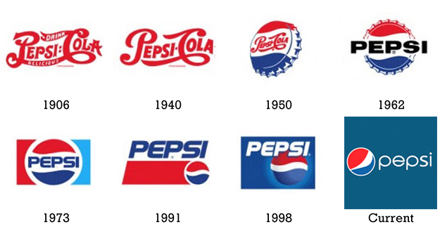
For a more striking series of changes, take a look at how the Pepsi logo has evolved in the century since its inception. What began as fancy red script on a white background has gradually turned into something quite the opposite, with simple, minimalist text accompanying the recognisable red/white/blue circle from its iconic bottle cap design.
Making changes like this to your logo when necessary will ensure your company image stays fresh. A good logo redesign can also go some way to getting press coverage, depending on the scale of your operations.
I hope you've enjoyed this article and find it useful when designing or redesigning your logo. What's your next step?

